

Tactile Type
The curious history of type designed to be felt, not seen.

In today’s world of Algorithmic/Artificial/Automated responses, curiosity is an underrated virtue. Digging a few layers deeper can uncover unexpected treasures; at least that’s what I continue to tell my students.
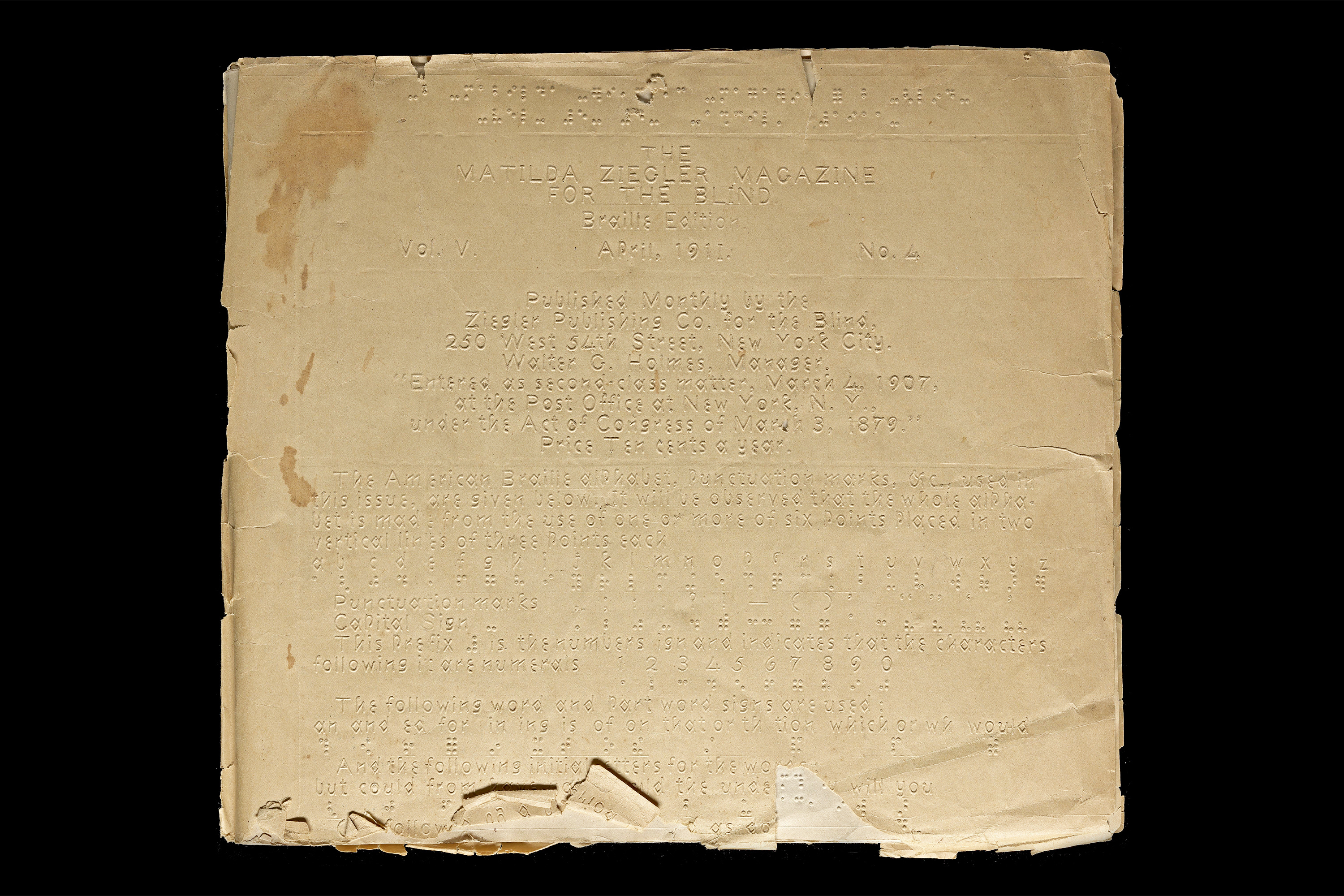
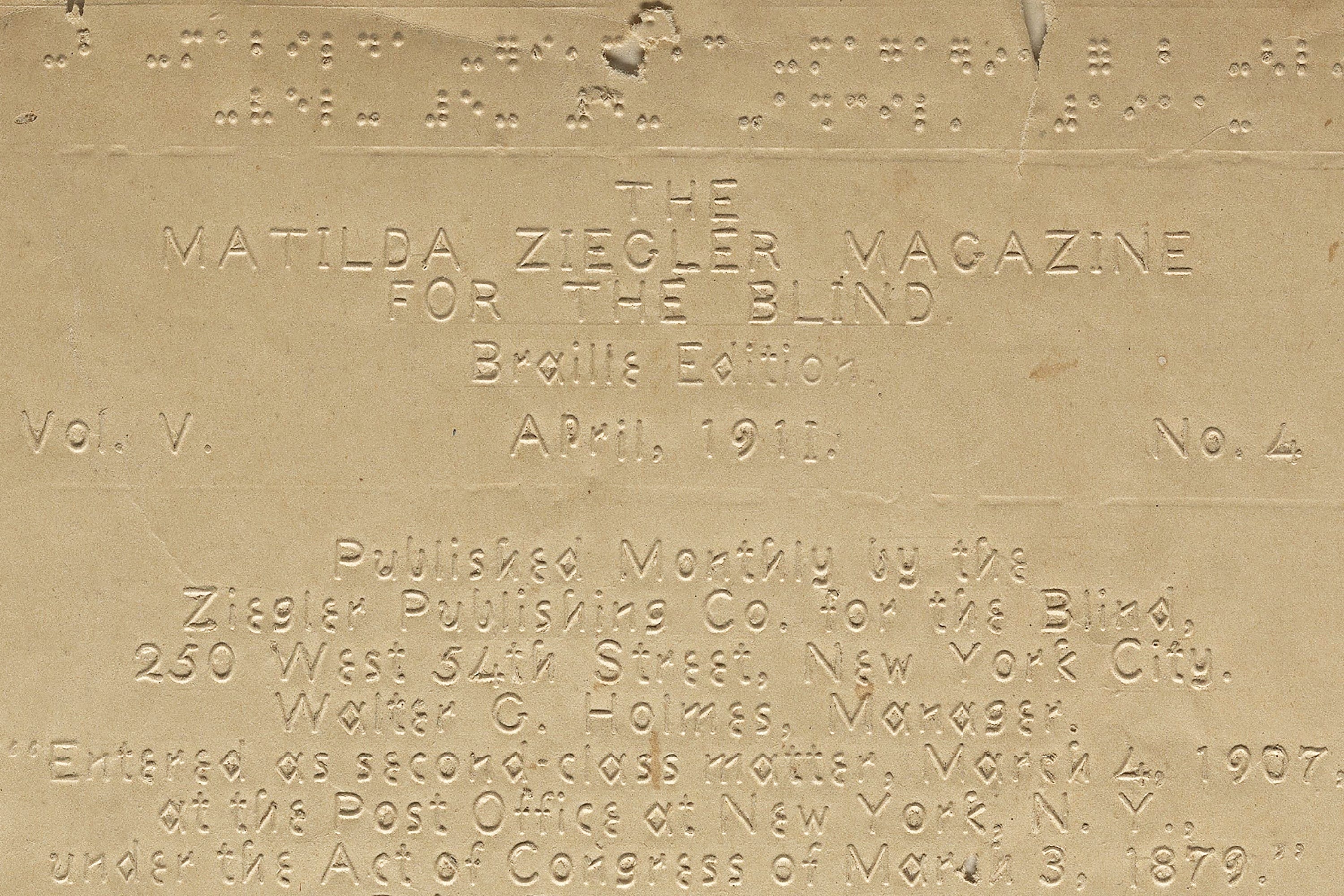
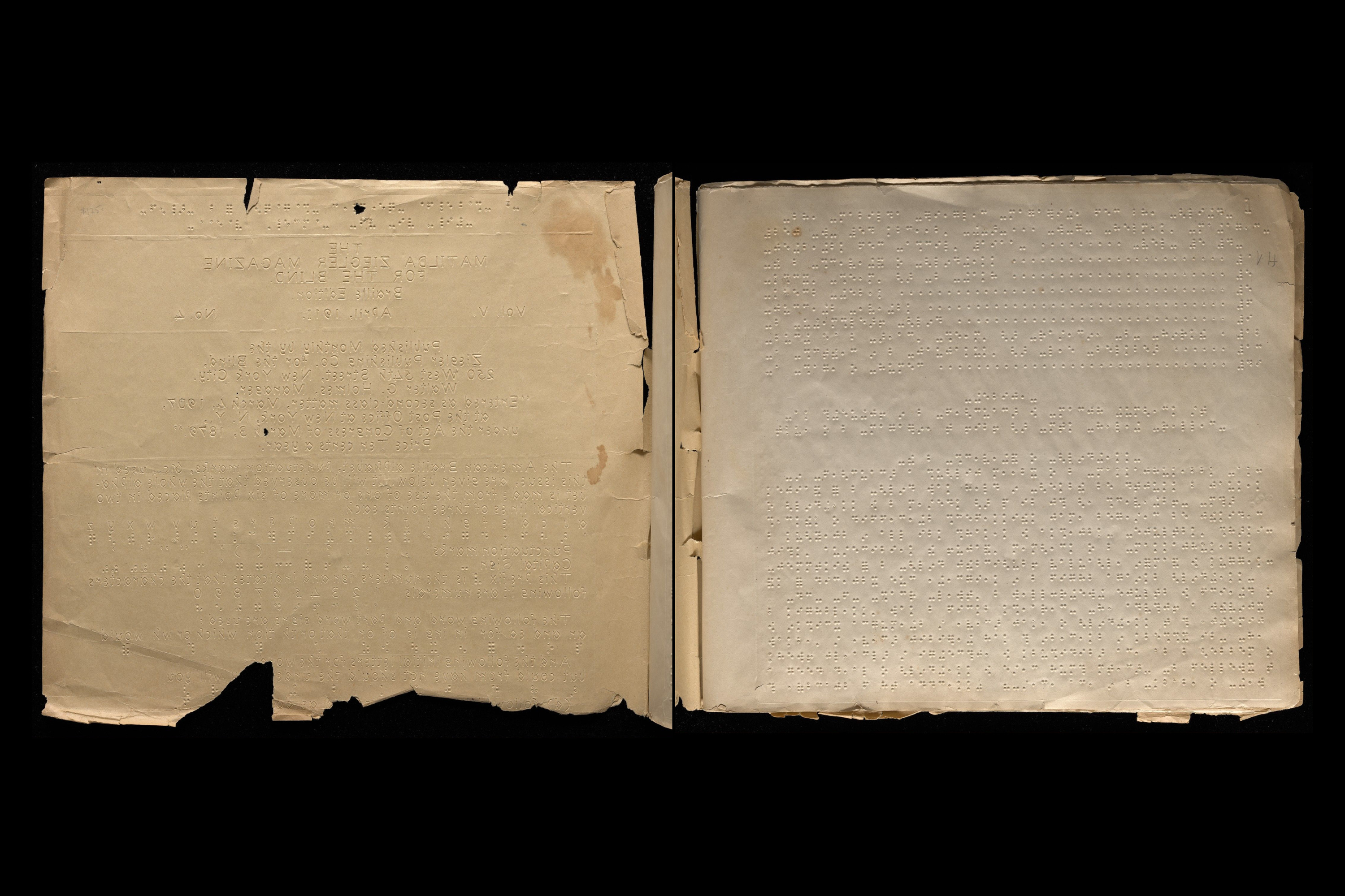
To illustrate my point, while researching inclusivity in type design, I stumbled across an image of the Matilda Ziegler Magazine for the Blind from 1911. Intrigued by the cover’s unusual font with its contrasting mix of angular and curved forms, I traced the image to its source, the archive of the Yale Library, uncovering a set of superb reproductions of the magazine’s internal pages. The distinctive monoline font only appeared on the jacket, with American Braille used throughout the publication; I began researching to find out more.
When my initial explorations proved fruitless, I reached out to a trusted type designer for guidance. Sure enough, he suggested the font may have been a version of ‘Boston Line Type’ (also known as Boston Line Letter), an embossed, angular font for the vision impaired developed by Dr Samuel Gridley Howe, an American physician, educator, and amateur type designer. Knowing very little about tactile typography, I decided to follow the thread.
Dr. Samuel Gridley Howe
Like many of the colourful characters in this story, Howe’s bio reads like the chief protagonist in an Indiana Jones film. Fired by enthusiasm for the Greek Revolution and following the example of his idol, Lord Byron, Howe had served as a military doctor in the Greek War of Independence in the 1820s and 30s. Upon his return, he was appointed superintendent of the New England Institution for the Education of the Blind (now the Perkins School for the Blind in Watertown, Massachusetts) and traveled to schools in France, England, and Scotland to study pedagogical models for educating the blind1.
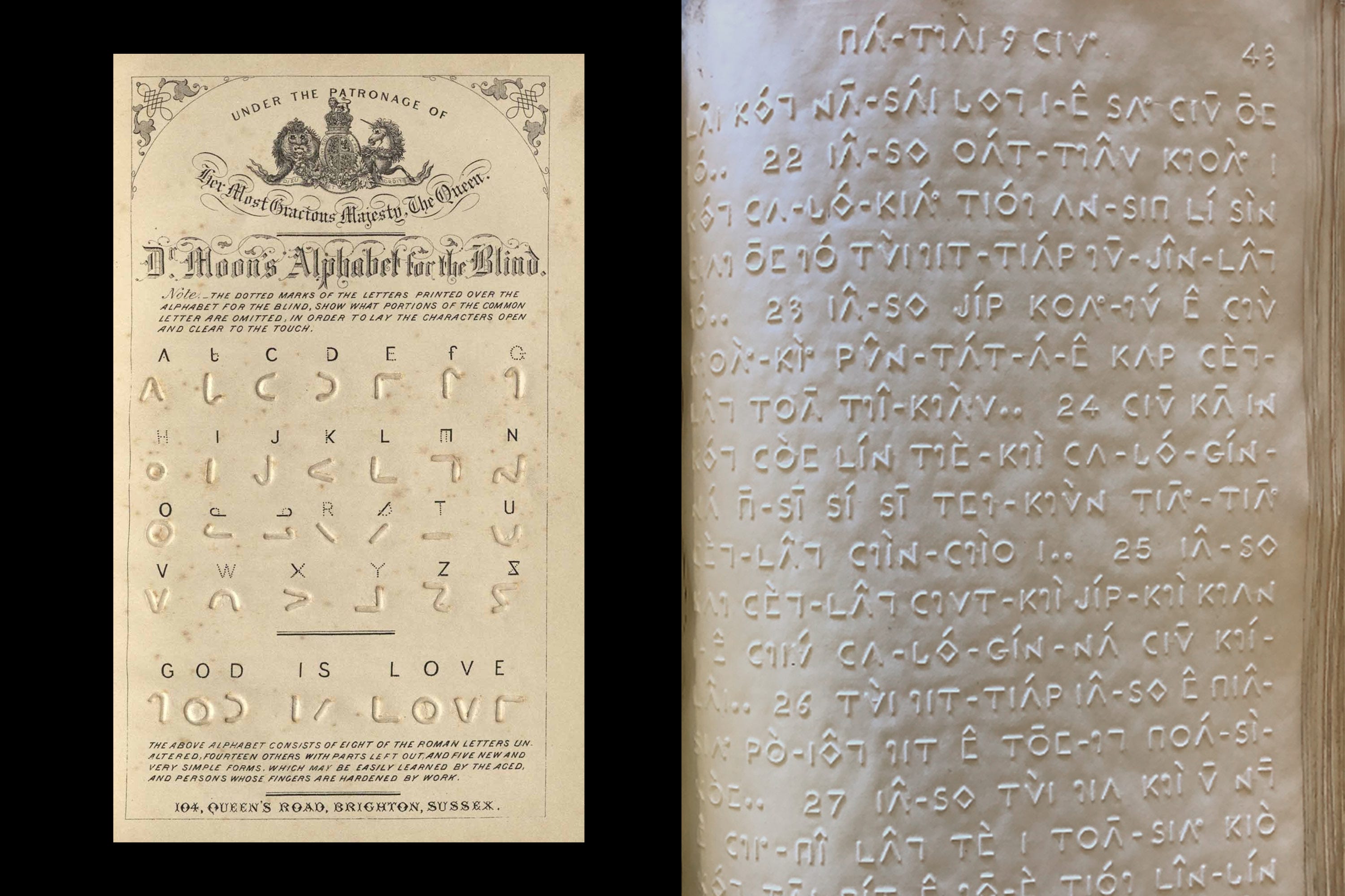
Committed to numerous social causes and a fierce advocate for the sight-impaired, Howe wrote a (very) long essay titled Education Of The Blind (1833)2 stating his belief that blind students should not be ‘doomed to inequality’ or regarded as ‘mere objects of pity’. With no evidence of formal training in type design, Howe set out to develop an embossed letter system to assist in reading for the vision-impaired. His primary reference was the work of another amateur type designer James Gall, a founder of the Royal Blind School in Edinburgh who designed a triangular alphabet based on Roman letters in 1826.
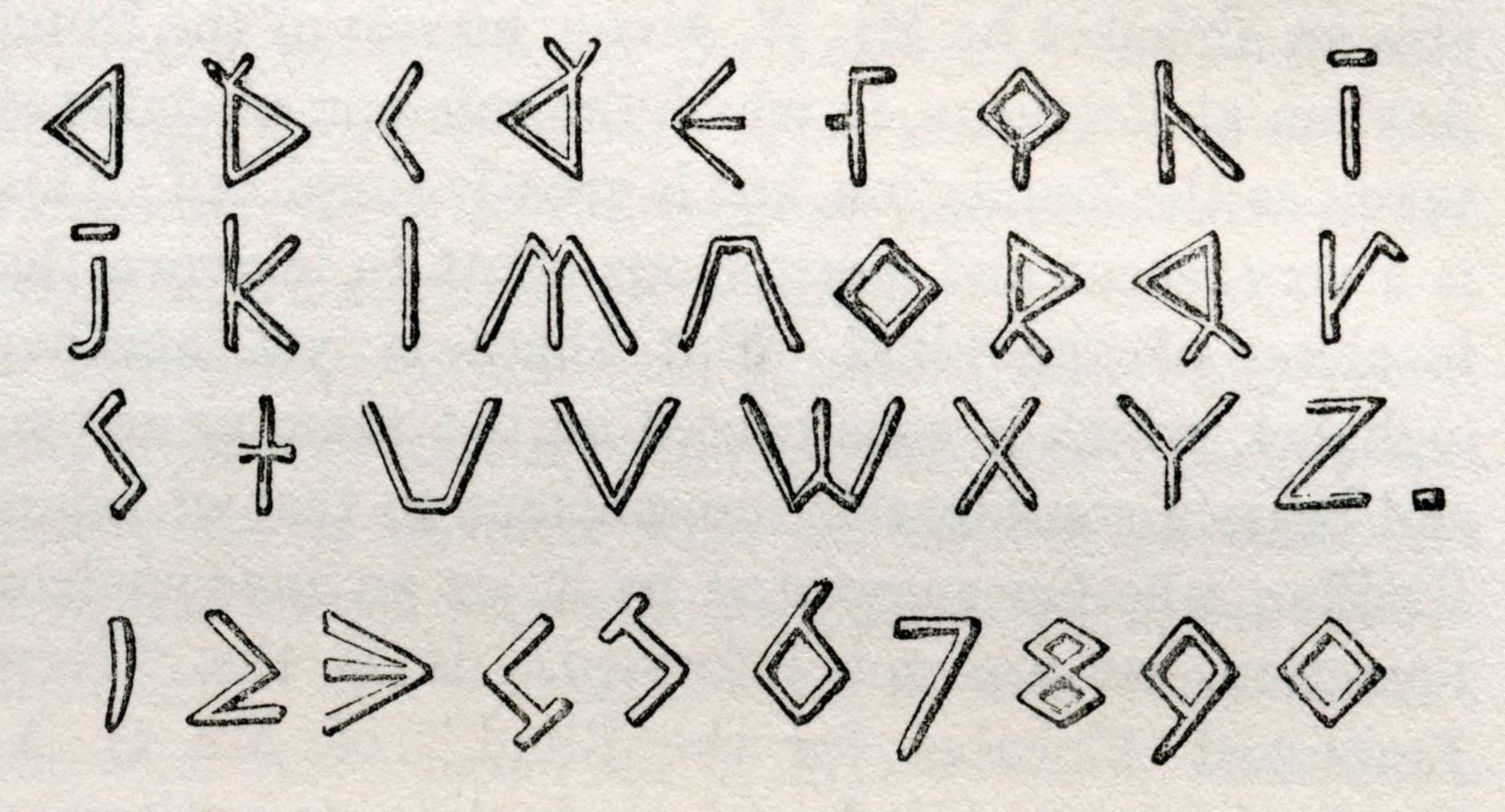
The angular forms of Gall’s font were more distinct to touch than traditional Latin-based alphabets that combine curves and angles. Excluding capitals reduced the character set to 26, helping to focus a reader’s attention. Though Gall made modifications to standard letterforms, he did not believe that arbitrary characters would ever be universally adopted, maintaining that books should be legible to both blind and seeing (unlike braille)3. This meant that family members, sighted teachers, and others could use the same embossed text books as someone who was blind, for teaching, reading aloud, or as a shared activity.
However, by pursuing this path of compromise, Gall (and later Howe) were unintentionally marginalising an entire category of the vision impaired. Readers who were blind from birth were faced with learning an altered version of a ‘conventional’ alphabet, rather than a customised approach like Louis Braille’s simplified system of gridded dots from the early 1800s. The ‘arbitrary symbols’ of braille were designed specifically to be read through touch and required less complex and expensive technology to reproduce.
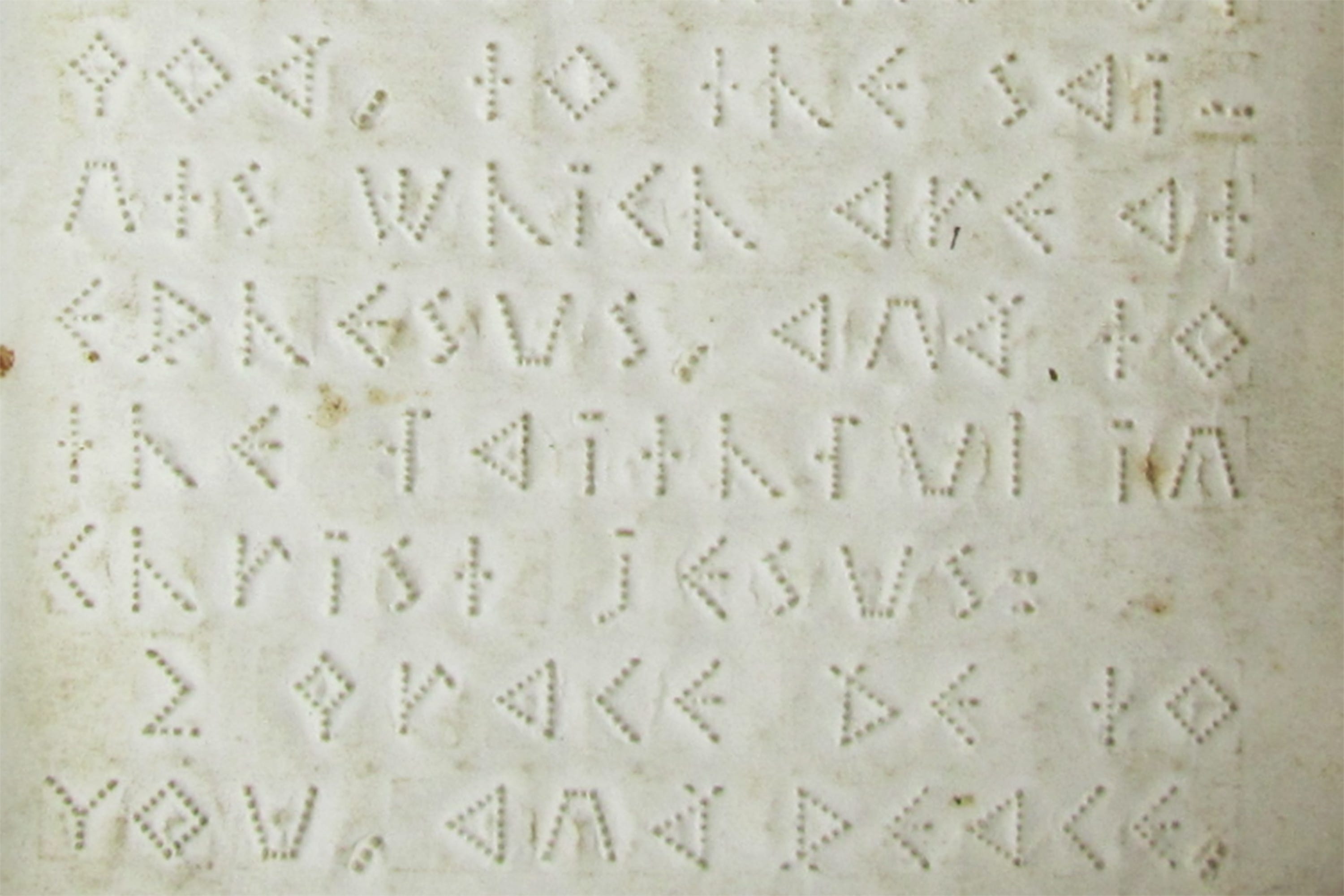
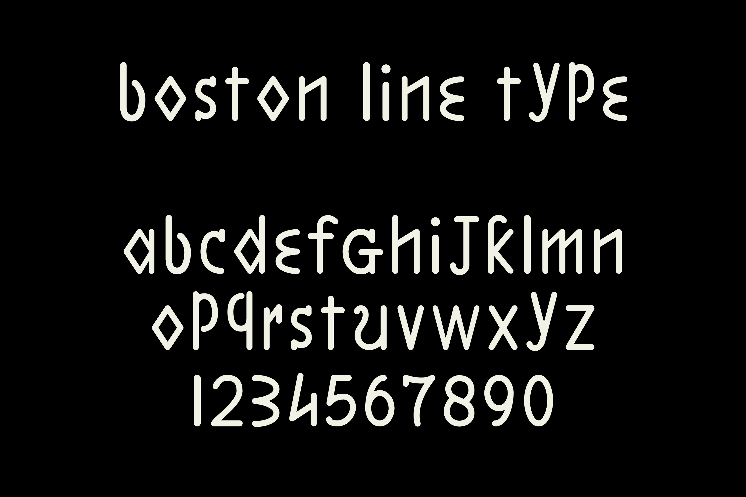
Boston Line Type
In 1835, Howe developed his own embossed alphabet called Boston Line Type (or Letter). The new tactile writing system was more compact than Gall’s alphabet and the letters less uniform, making it easier to discern between individual characters. Like Gall, he excluded capitals, aligning all letters to a baseline which, for the sighted, creates an unsettling visual rhythm as the letters seem to jump and down. Though Boston Line type helped individuals blinded later in life who found it easier to learn than Braille’s dots, the angular forms proved challenging and too complex for many blind students to read effectively with their fingertips. It was, however, a significant early step in tactile literacy, paving the way for the broader adoption of more user-friendly systems.
Stephen Preston Ruggles
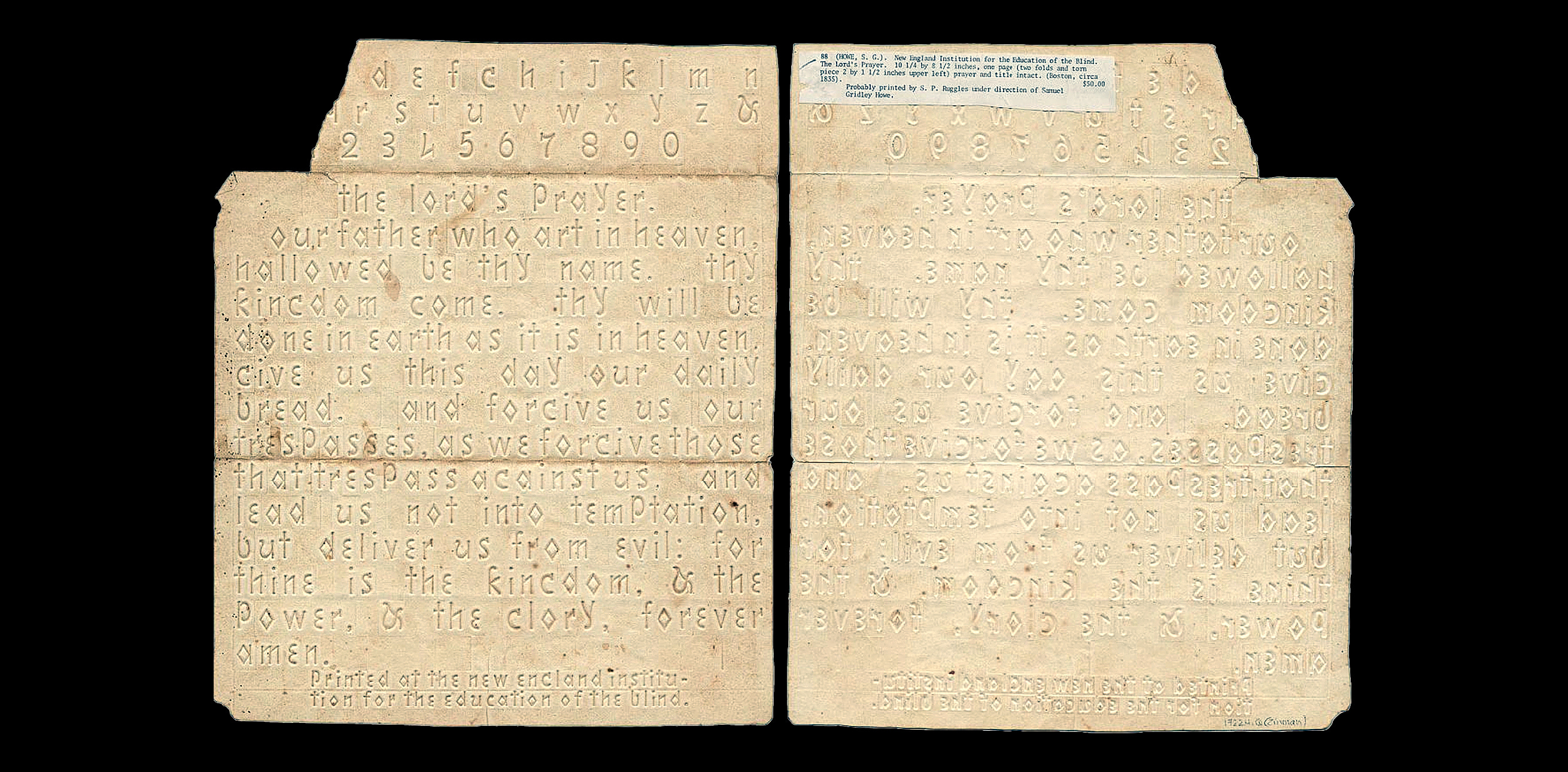
A major obstacle faced by Howe and other pioneers of tactile type was printing. Reproducing books for the blind in dimensional techniques such as embossing required a shift in thinking; from what could be seen, to what could be felt. This paradigm shift from printing letters to embossing them meant a technological revolution in printing and paper was needed.
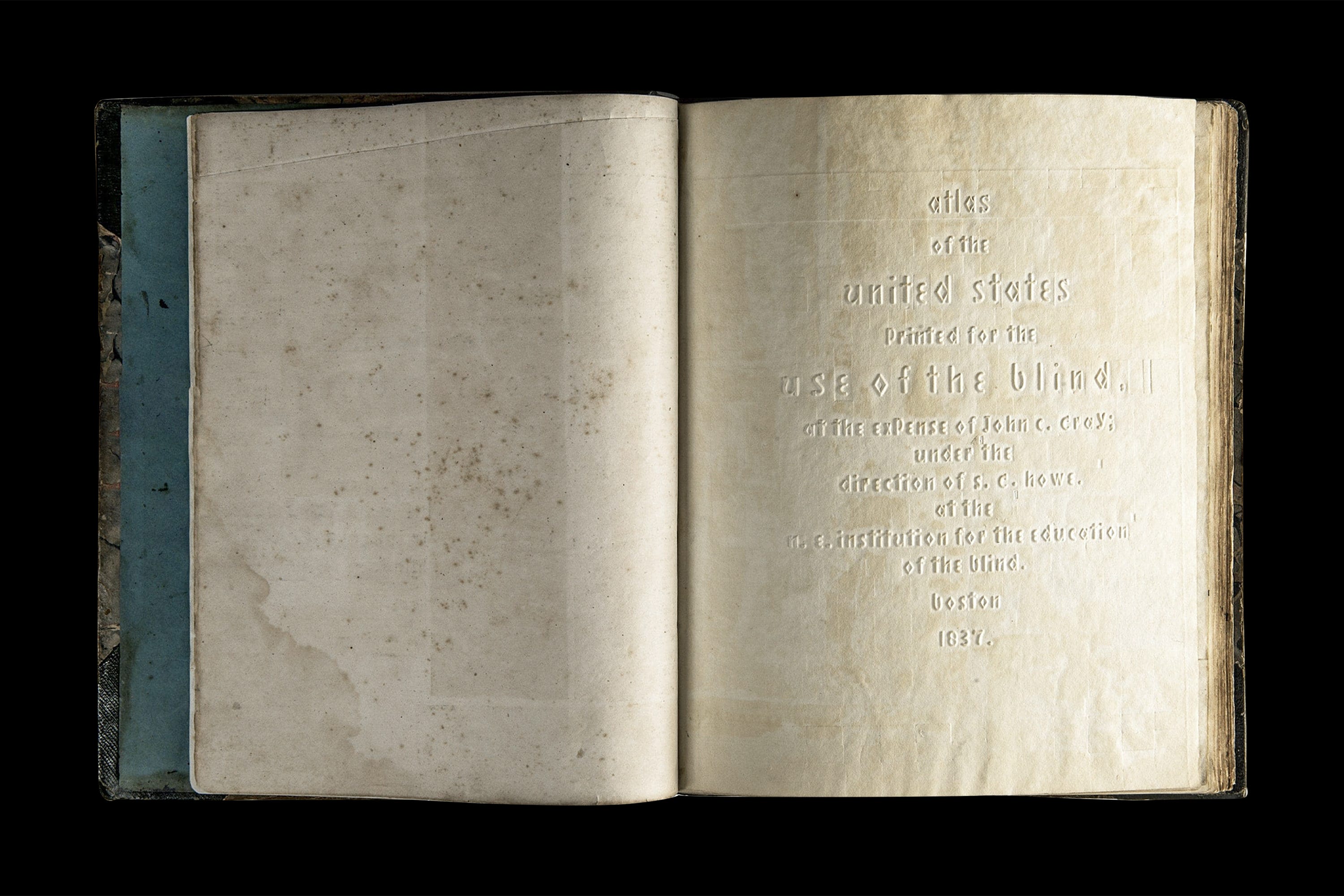
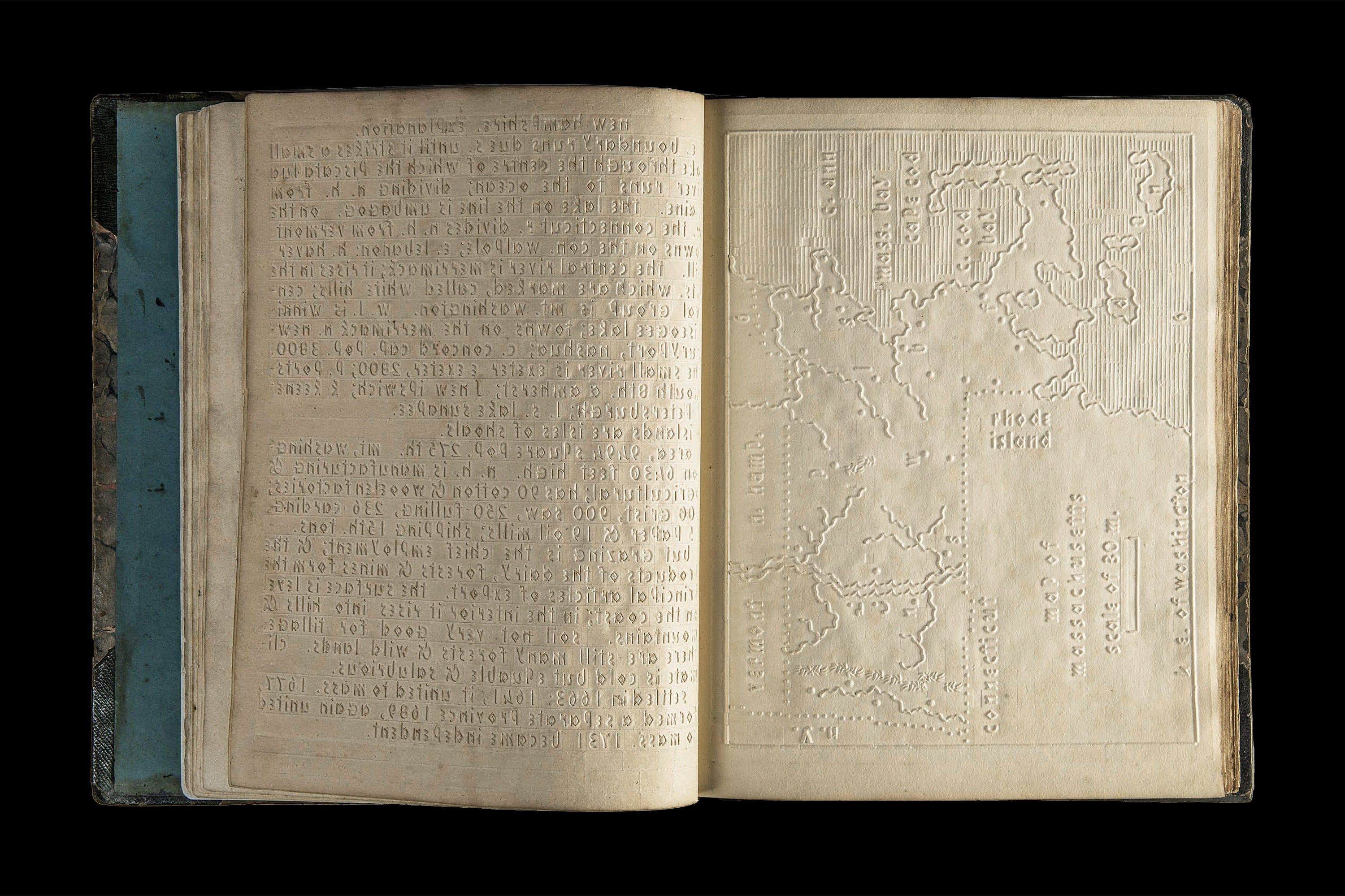
To meet the challenge of producing his specialised books, Howe made a critical decision by recruiting Stephen Preston Ruggles, an engineer and inventor to establish an in-house printing shop. Ruggles designed and built the first printing press for Perkins, revolutionising the way that books were made for the visually impaired. He also experimented with producing paper, eventually arriving at a parchment-like sheet specifically engineered for the rigours of embossing4. Over time, his output included spelling books, and more ambitious outcomes such as a New Testament, Book of Psalms and a complete Bible. All were typeset in Boston Line Type, which remained in use for decades until replaced by Braille in the late 1800s. The school also painstakingly produced tactile maps by hand. In 1837 a frustrated Howe asked Ruggles to rethink the process, resulting in a new methodology later adopted for map-making projects across the world.
Towards a unified system
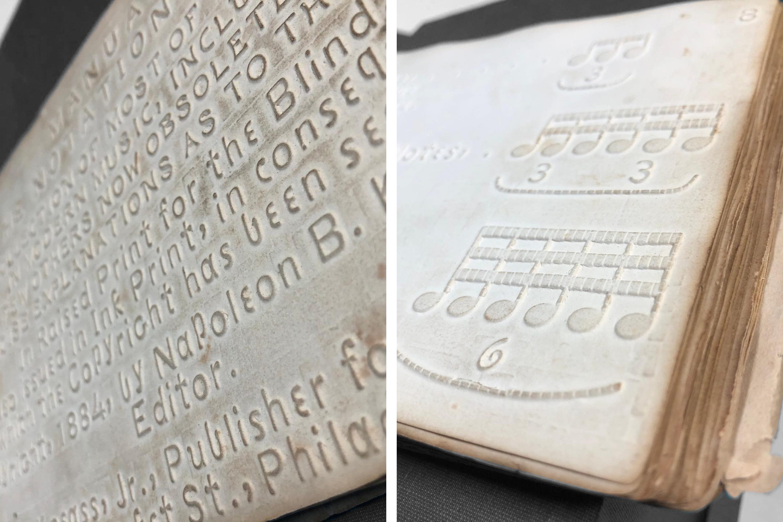
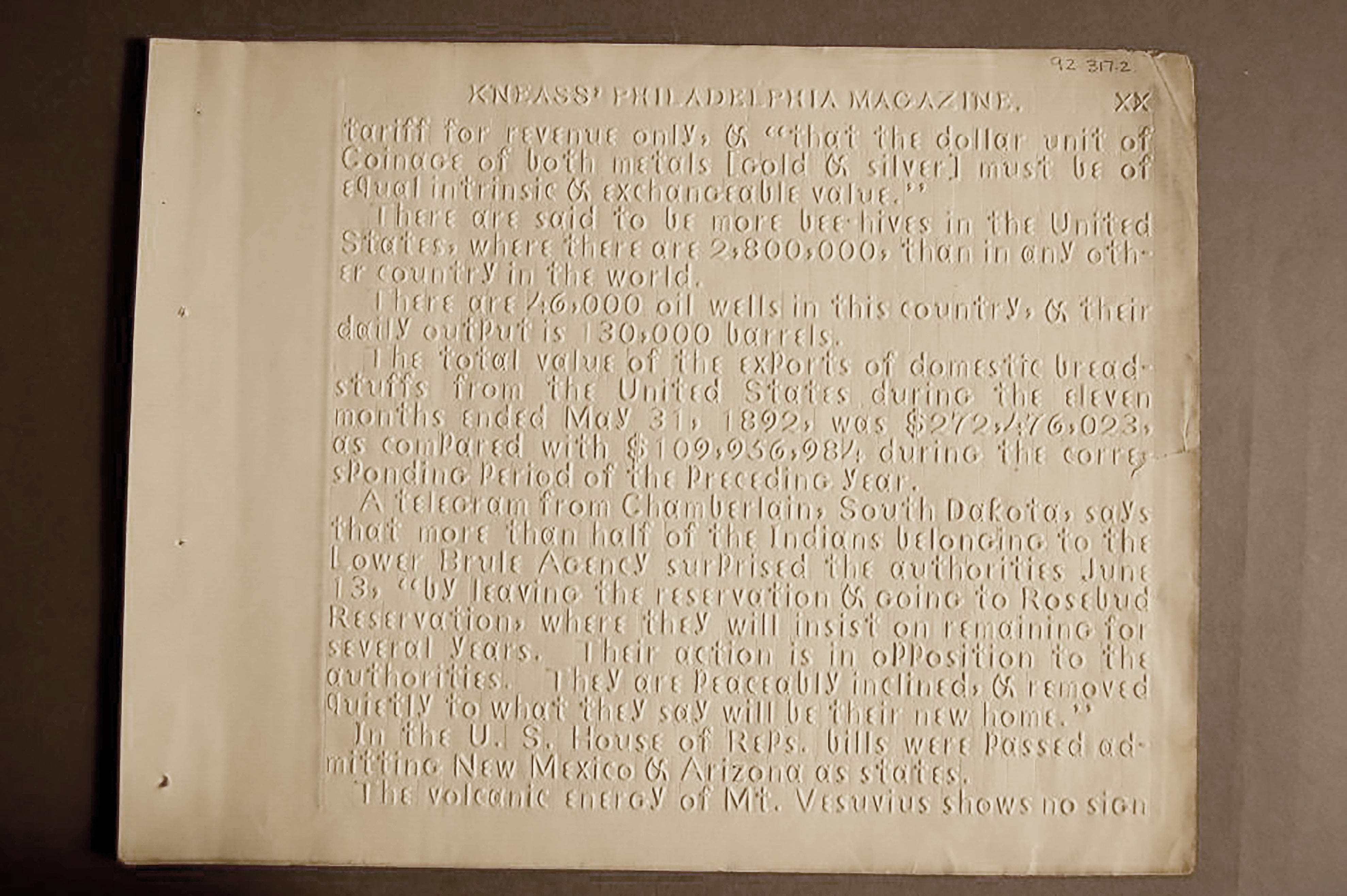
By 1868, Napoleon Bonaparte Kneass Jr, a printer in Philadelphia, had adapted what became known as a ‘combined system’ using the lower case forms of Boston line letter and capital letters from a rival tactile font called Philadelphia Line. Until it was replaced by dot systems, this hybrid form of raised letters was the predominant embossed type for blind people in the United States and the choice of most of the schools.
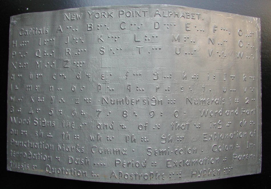
Throughout the 19th century, multiple competing tactile systems were promoted by different schools, creating confusion and vested interests that stalled consensus. Unlike Europe where braille gained traction throughout the mid-19th century, it took until 1932 for a unified standard of English Braille to be agreed upon in the US. Perhaps, in an echo of today, isolationist thinking meant that American educators refused to believe that foreign alternatives could be superior to theirs.
Critically, key decisions were often in the hands of well-meaning sighted administrators (like Howe and Gall) who favoured systems resembling the Roman alphabet, ultimately to the detriment of some blind readers. Conversely, Louis Braille was blinded at the age of three5. One can easily conclude that drawing upon his own experiences and needs profoundly influenced the creation of his pioneering tactile system, a code adapted to almost every known language from Albanian to Zulu. Today, this principle has a name: user-centred design.
The long resistance to a unified system of braille in the United States was not a failure of ingenuity, but of authorship. Braille’s eventual success underscores a truth that still resonates today — the most effective design does not emerge from compromise or convention, but from listening closely to those for whom it is intended. In an age increasingly dominated by automated answers and surface-level solutions, this story of tactile typography reminds us that curiosity, innovation, and genuine user-centred thinking remain fundamental to any design process.
https://www.britannica.com/biography/Samuel-Gridley-Howe
https://socialwelfare.library.vcu.edu/issues/education-blind-1833/
https://www.catholic.com/encyclopedia/education-of-the-blind
https://www.jstor.org/stable/25138625?seq=2
https://www.nbp.org/ic/nbp/about/aboutbraille/whoislouis.html
Your article has got me thinking about Herbert Bayer’s 1925-ish Universal Font, designed for sighted use but considered ground-breaking for its ‘single case’ design approach, as much as its geometrical styling. The few fonts you’ve shown were developed many decades before and there’s some really interesting approaches to their design.
Fantastic writeup! This + your "Mongrel Type" post have been a joy to read. Excited to see what you post next! Any plans to translate this from analog to digital?