

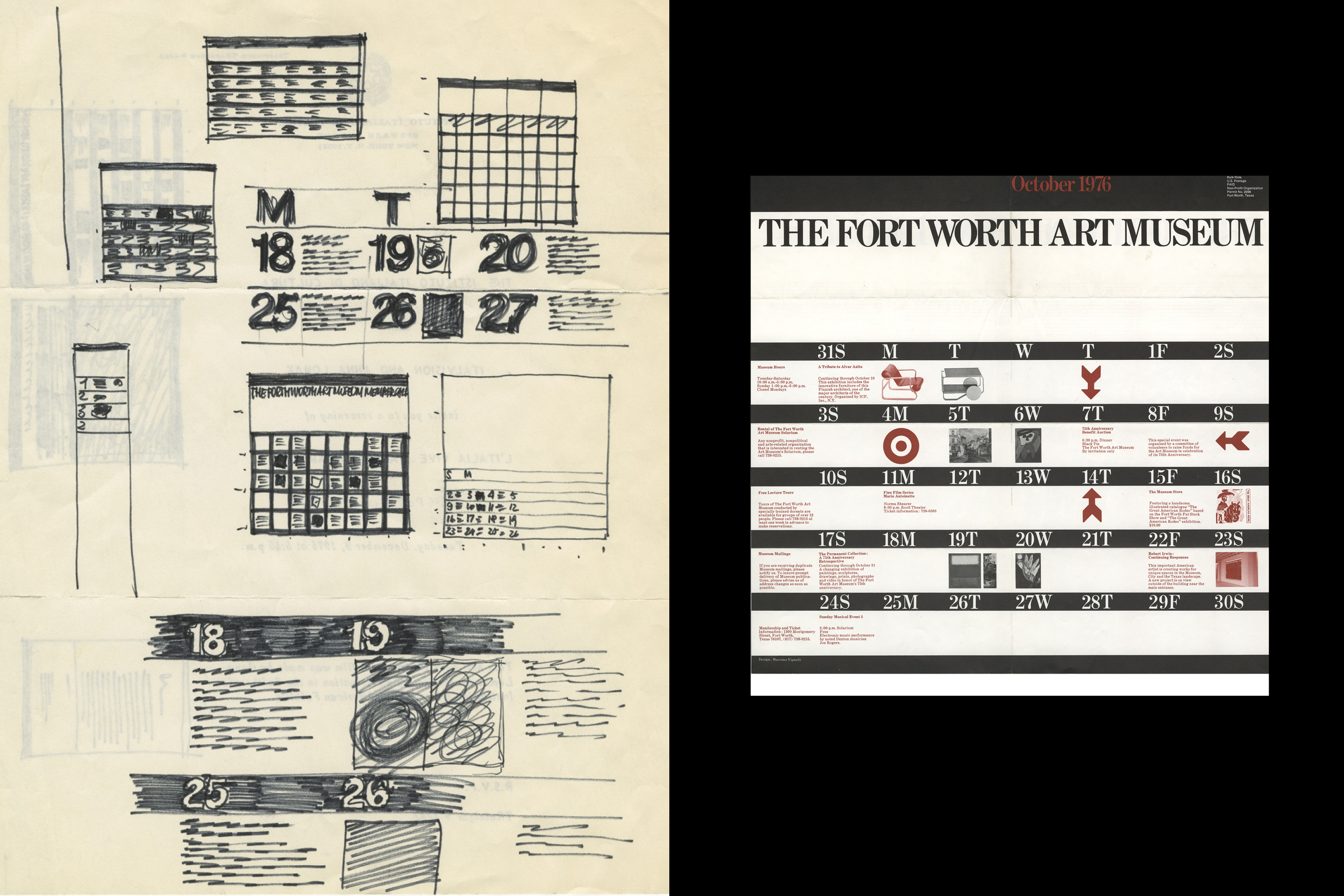
Interpretive Type
The beauty of illegibility.

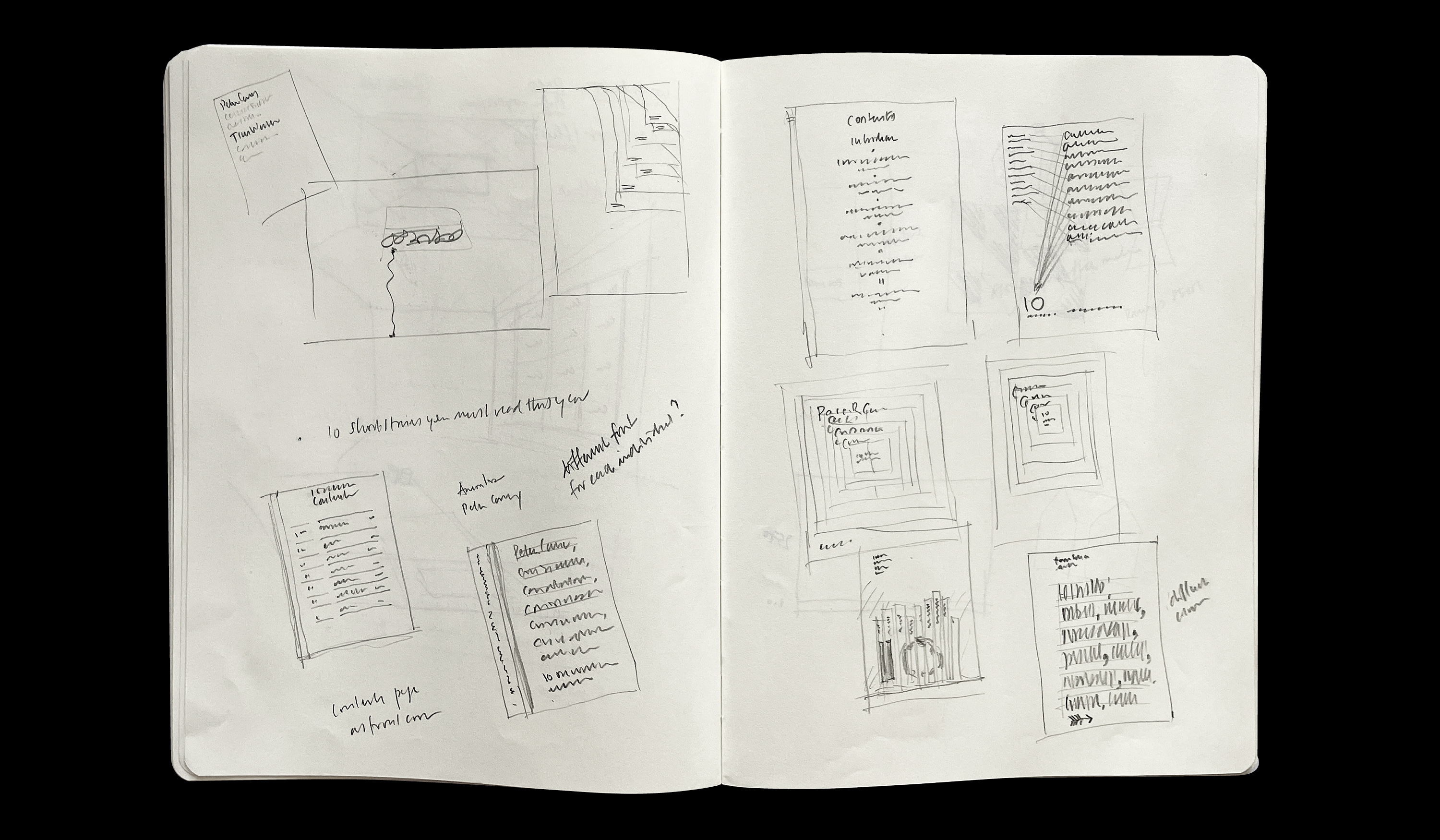
When establishing a grid, defining typographic hierarchy, or composing a layout, sketching on paper remains my starting point. The transition from page to screen, however, has become far more immediate over the years.
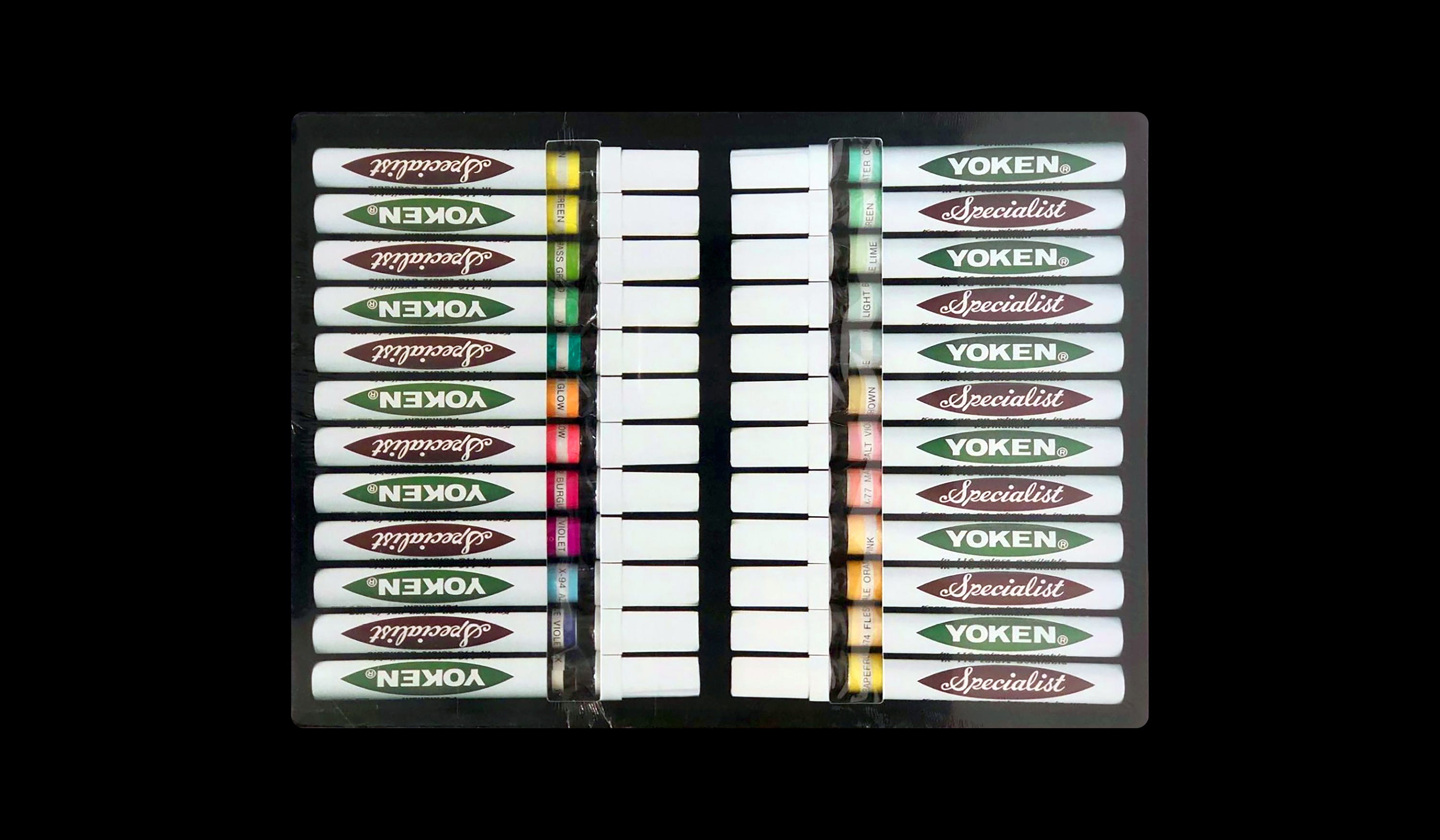
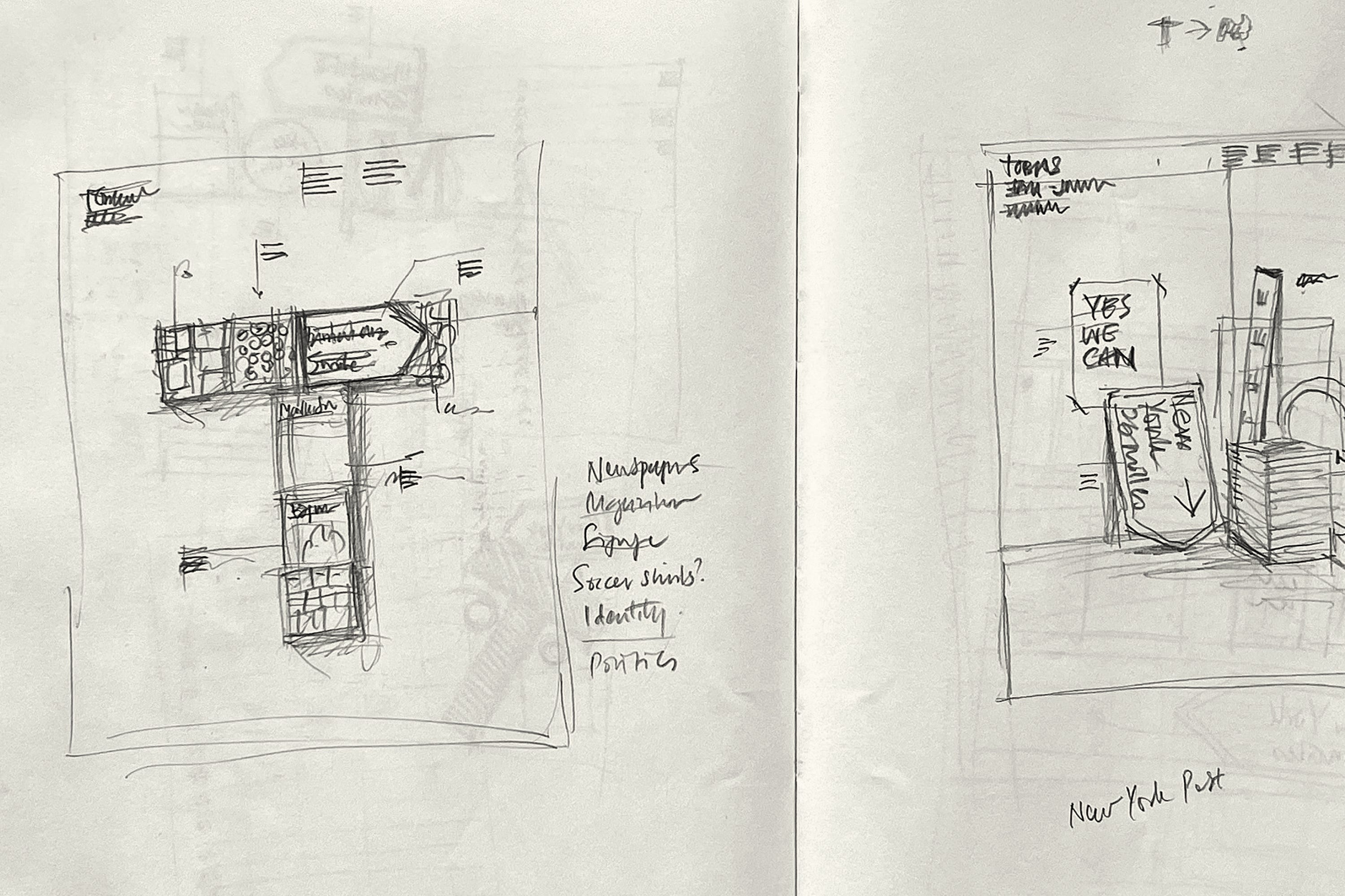
Drawing, in its many forms, was a core subject in my first year at design school. This suited me well, as I joined the course with a portfolio made up entirely of pencil sketches. Faced with subjects such as Audio Visual Technology, Graphic Design Practice, and Human Studies, drawing was my comfort zone (with the exception of life drawing, which I found acutely uncomfortable). We were expected to master a range of new tools, including airbrushes, technical pens, and Yoken markers. Used to visualise advertisements and page layouts, the Yoken was inexplicably expensive, though its cost was partially offset by an unexpected side effect; a headache-inducing high caused by the methylated spirits that powered the marker’s thirsty nib.
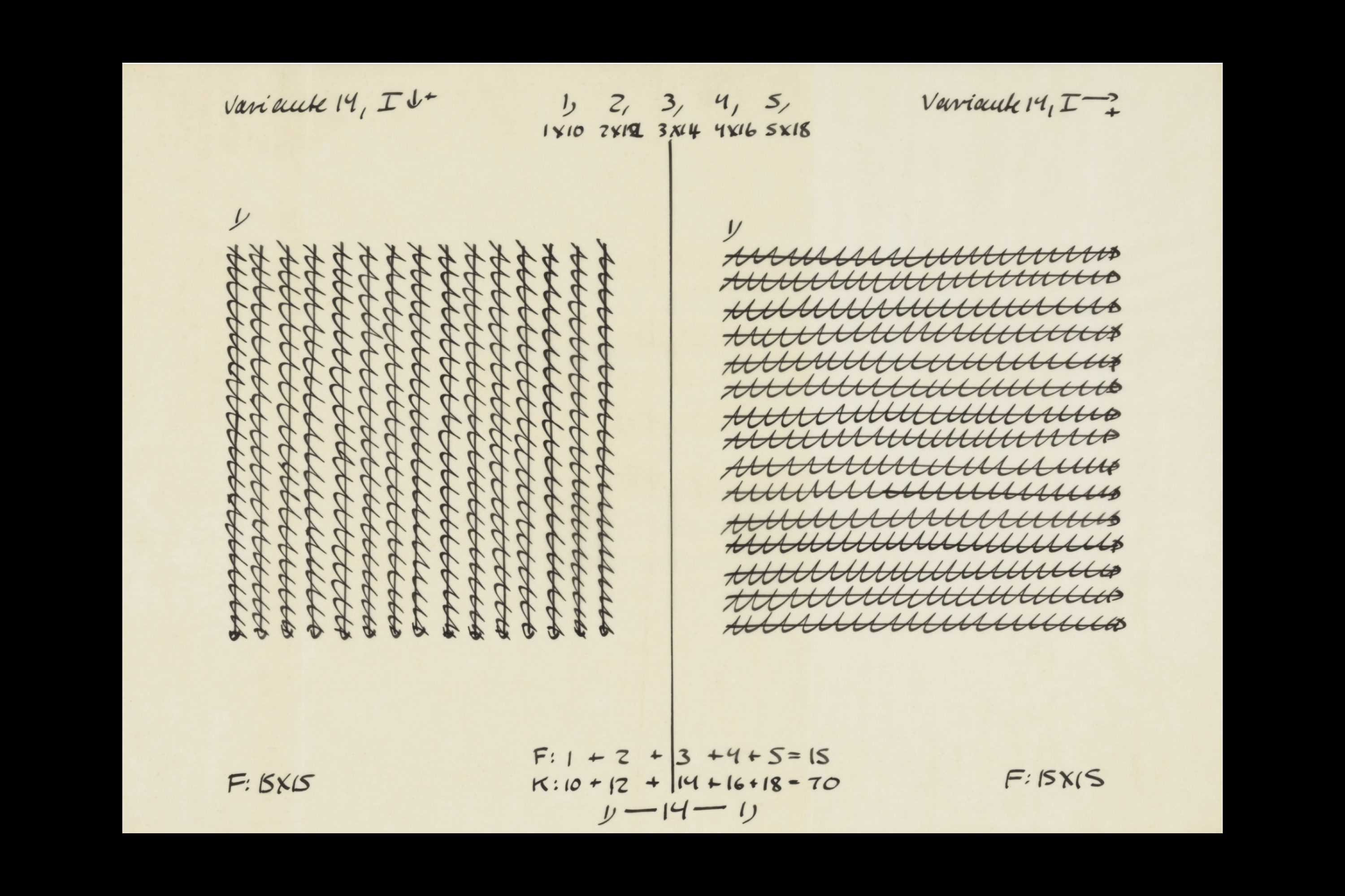
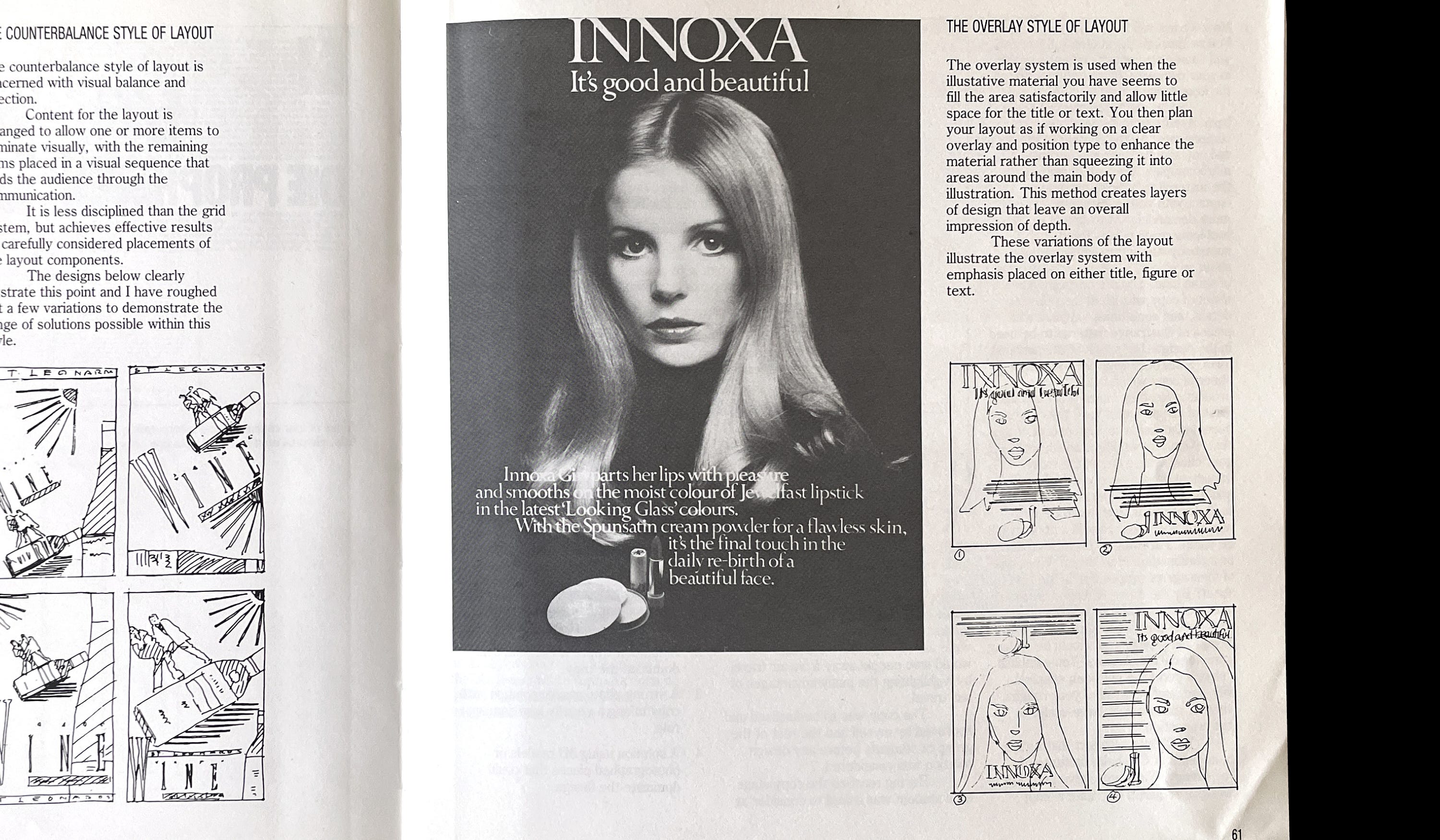
The aim of comping advertising layouts was to visualise an idea quickly and economically. A typical layout consisted of basic elements — photography or illustration, a headline, and supporting copy — rendered as simple lines of varying weights. In retrospect, drawing these abstract lines taught me a great deal about the fundamentals of typesetting: scale, leading, rag. Understanding typography as a compositional element, rather than solely a vehicle for language, was an enduring by-product of this process.
I also value the openness inherent in this approach. Without the pixel-perfect certainty of a digital layout, a sketch remains a proposition rather than a conclusion.
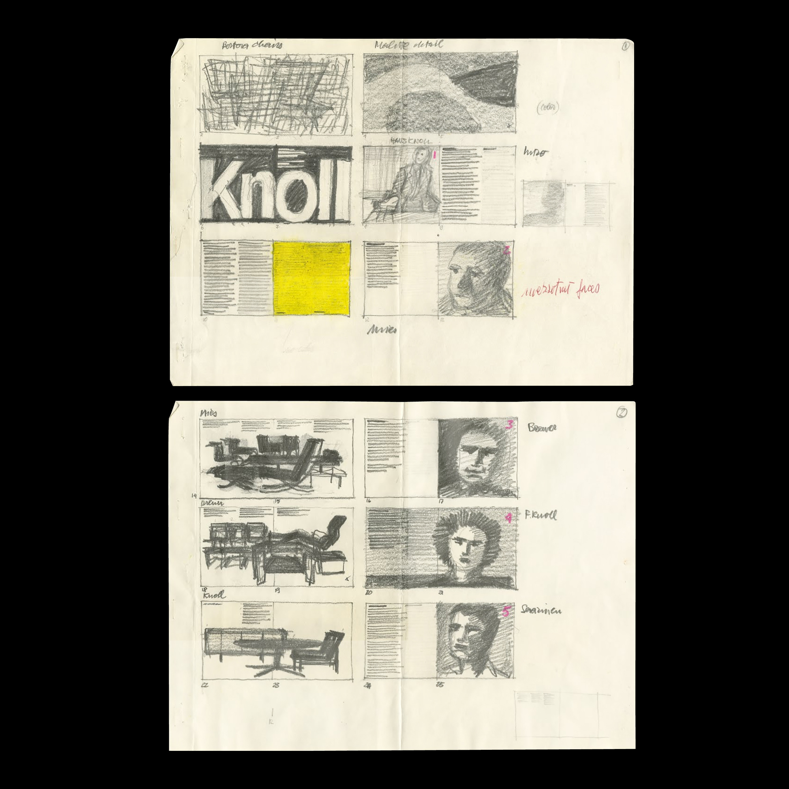
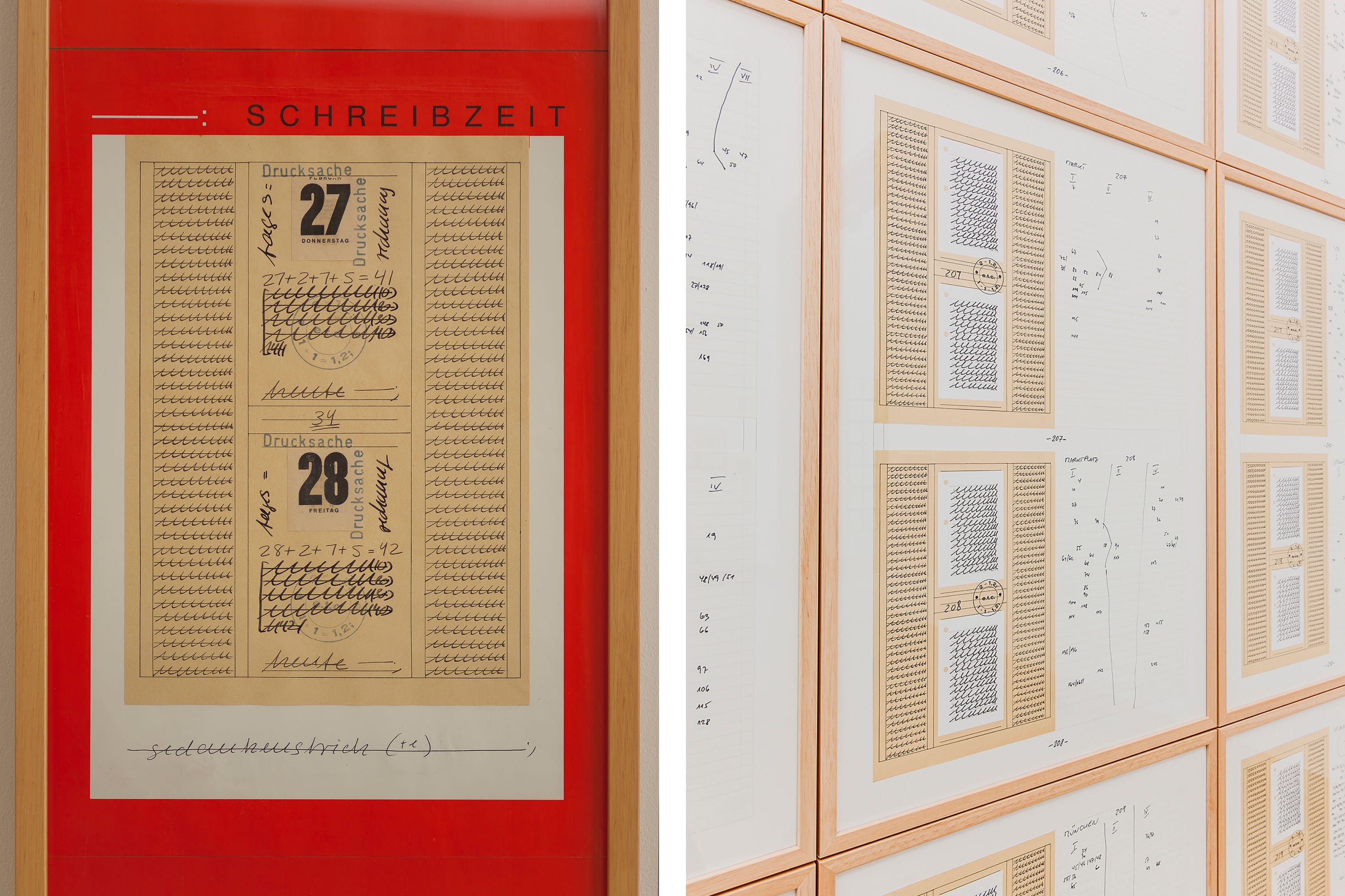
Drawing was a foundational skill for all pre-digital designers, including Massimo Vignelli. His studies in art and architecture led to early work with prominent Milanese architects and designers, where pencils and technical pens were omnipresent. Drawing remained central to his methodology throughout his career, even after the arrival of the computer. He believed it was faster, more efficient, and more conducive to creative flow. Over time, he refined his technique to the point where his layouts — particularly for books — became scaled-down facsimiles of the finished work. Michael Bierut, who worked with Vignelli for a decade at Pentagram, described the process: ‘he sits with all the ingredients — text and images — and draws each page with a pencil, including every photograph, using a grid as a layout guide.’
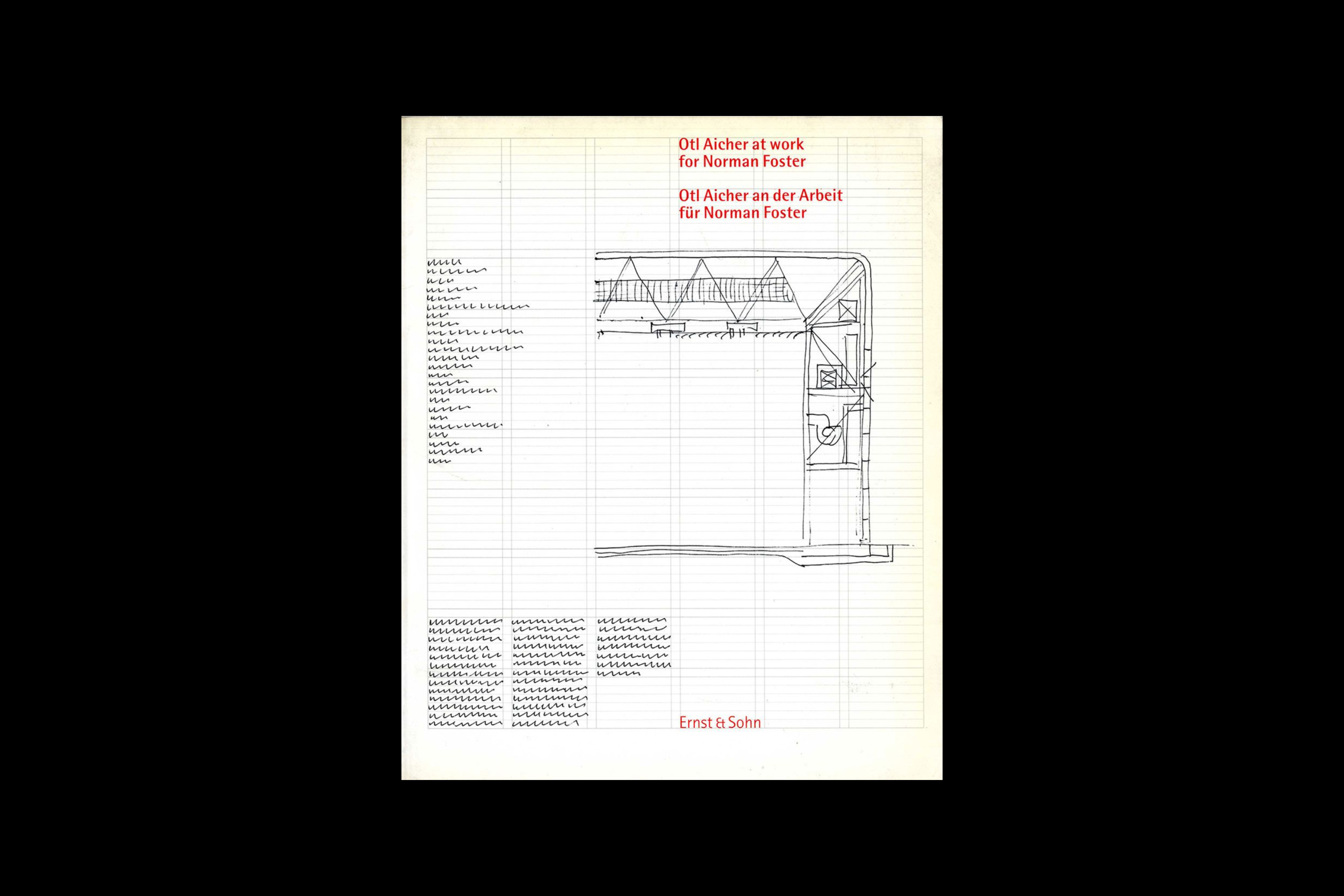
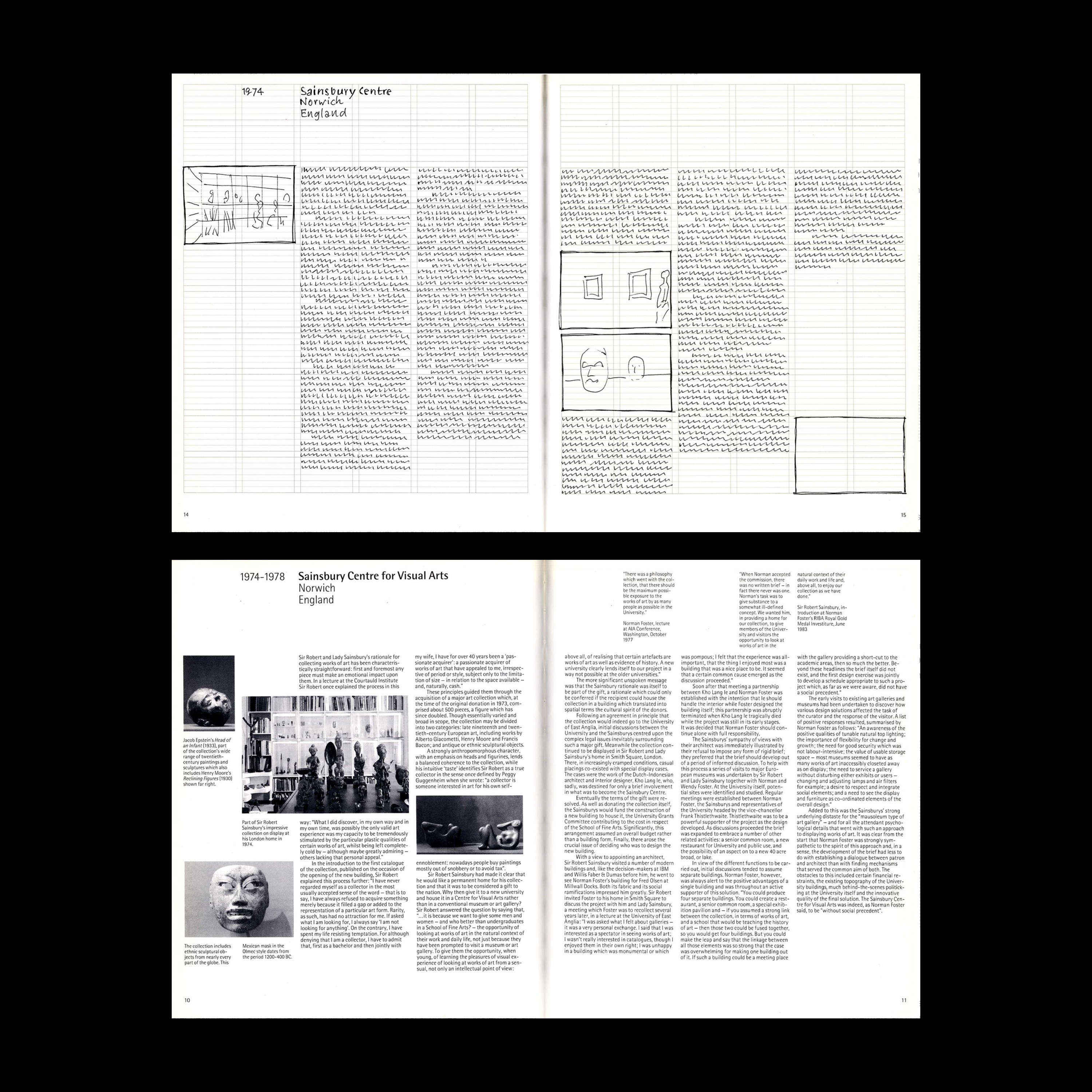
Otl Aicher, another iconic modernist, also understood the value of visualising type through drawing. His commitment to this approach is documented in Otl Aicher at Work for Norman Foster, a unique book that explores both his design methodology and the collaborative partnership he shared with the esteemed English architect. Published alongside a four-volume monograph on Foster’s work, the book reveals how Aicher sketched every page ‘in order to make sure of the final effect.’ The publishers chose to reproduce a selection of these sketches, ‘partly to convey an idea of the genesis of a book, and partly because we consider them to be little masterpieces in their own right.’
Type as Art
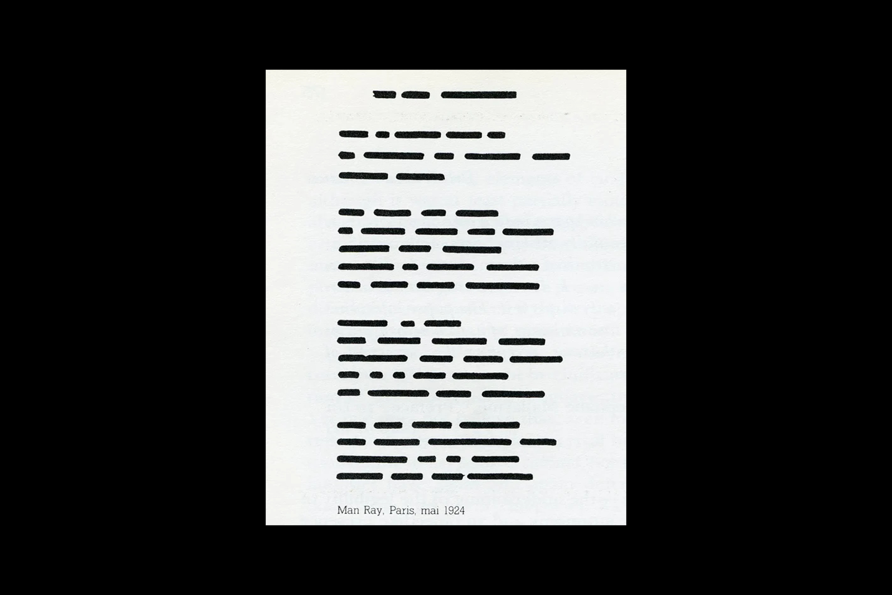
Artists, too, have long been drawn to the abstract qualities of typography. In 1924, the Dada and Surrealist artist Man Ray used lines to stand in for the words of a poem, creating a typographic composition that reads like a piece of encrypted code.
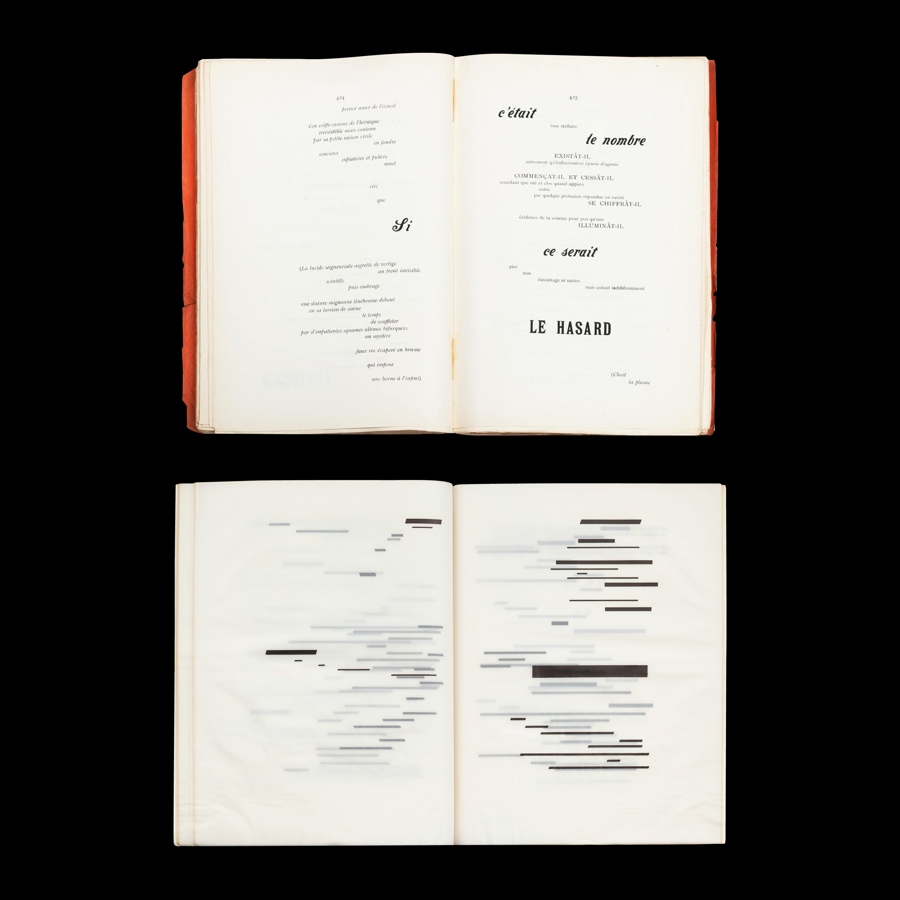
Similarly, conceptual artist Marcel Broodthaers produced a homage to Un Coup de dés jamais n’abolira le hasard by Stéphane Mallarmé, replacing the poem’s text with solid black bars of varying widths. Mallarmé’s influential work was transformed from text into image.
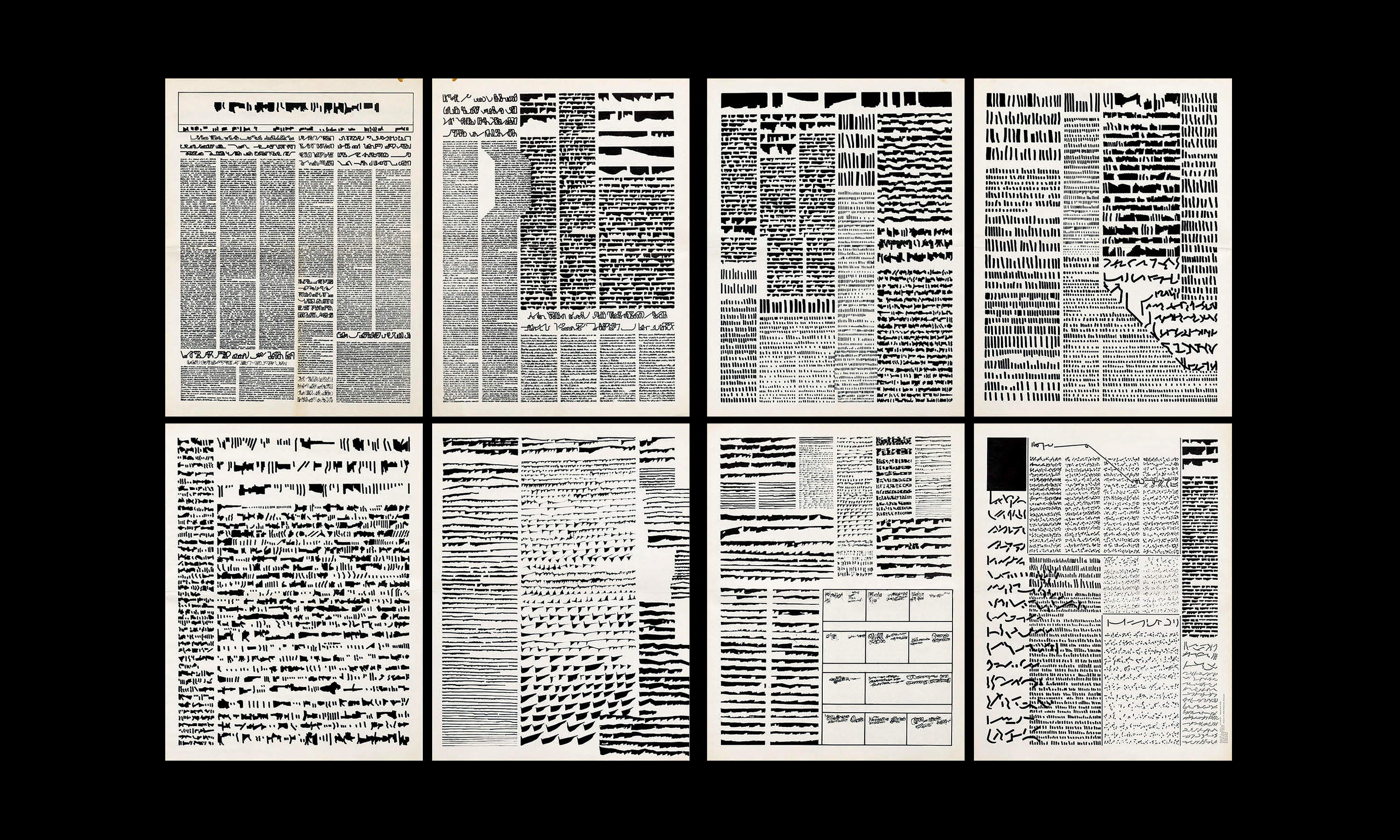
From the 1960s onward, Argentine conceptual artist Mirtha Dermisache produced publications filled with marks resembling text. While these pages mimic the familiar structures of typographic communication, their content is entirely abstract, inviting viewers to project their own meanings.
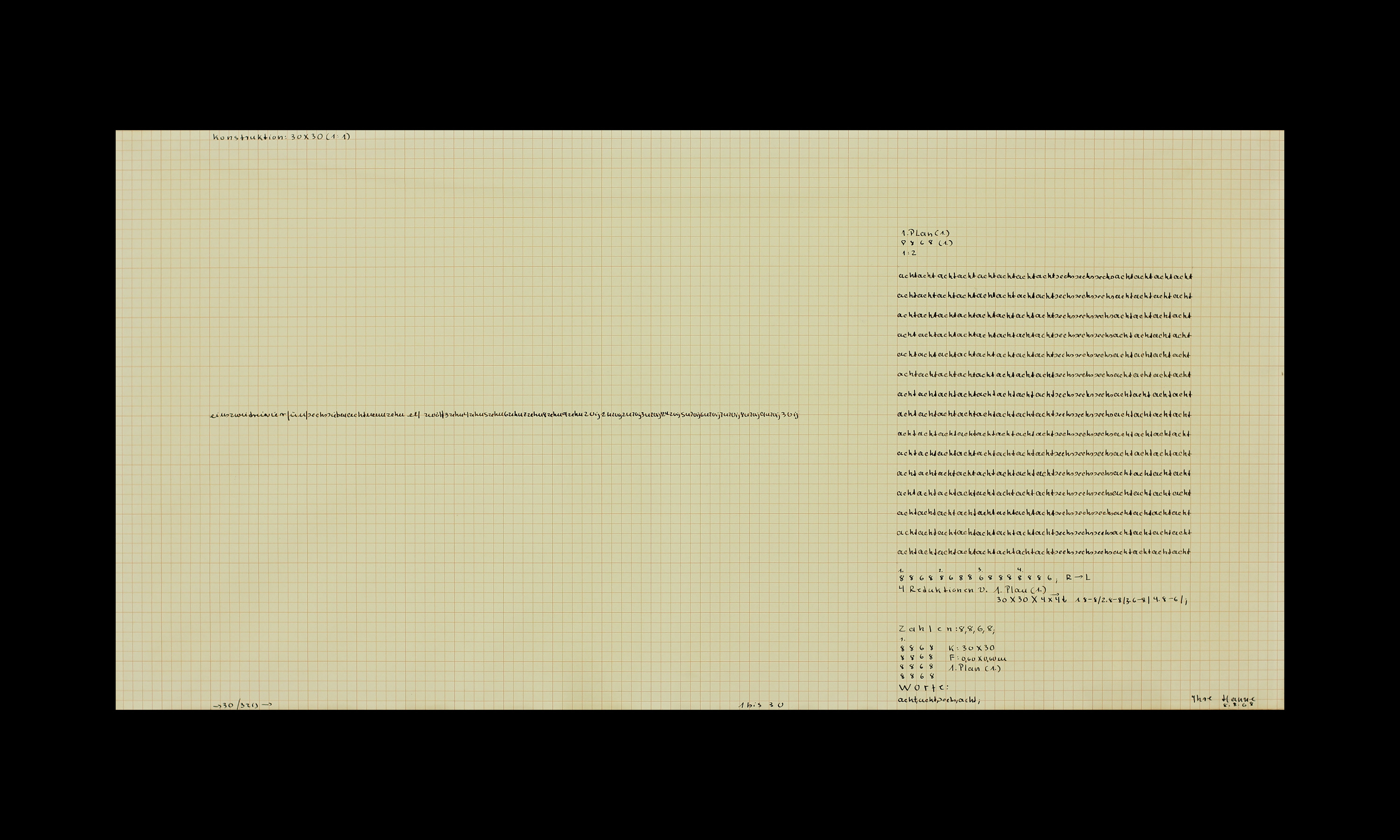
Hanne Darboven was a German conceptual artist best known for using writing, numbers, and serial systems to make time visible. Her handwriting is not expressive in the traditional sense, but systemic and obsessive, apparently devoid of narrative and transformed into structure.
Rafaël Rozendaal’s art project Abstract Browsing is an extension that turns any website into a colourful abstract composition; ‘It shows you the skeleton of the web. It’s like seeing an X-ray of a building, showing the structural elements. I’m looking for unusual compositions. Anti-compositions, unhuman compositions, compositions that humans would not have created on their own’.
Everyday abstraction
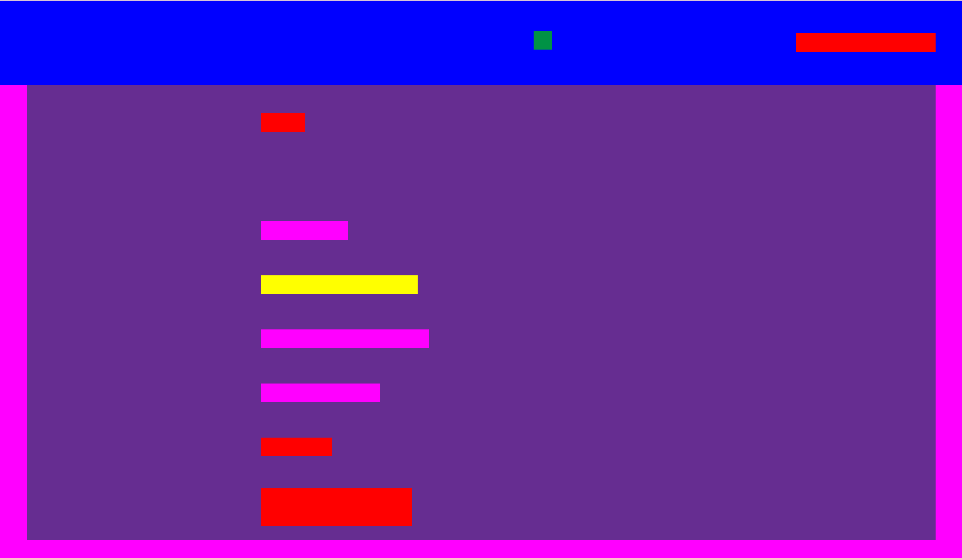
In contemporary digital environments, UI icon design reduces forms to their bare essentials in much the same way that a pen or marker reduces letterforms to abstract strokes. Before content loads, screens often display grey placeholder shapes — silent compositions that hint at structure without meaning.
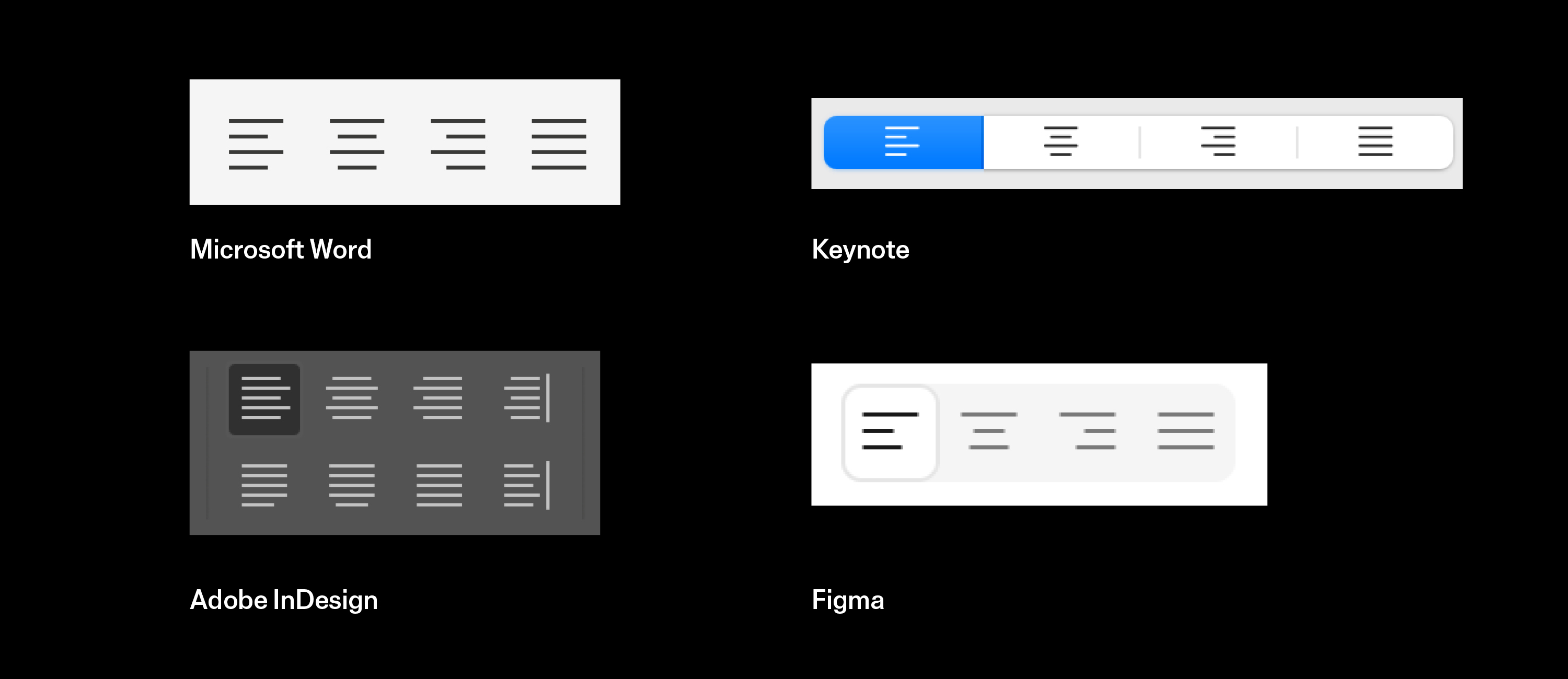
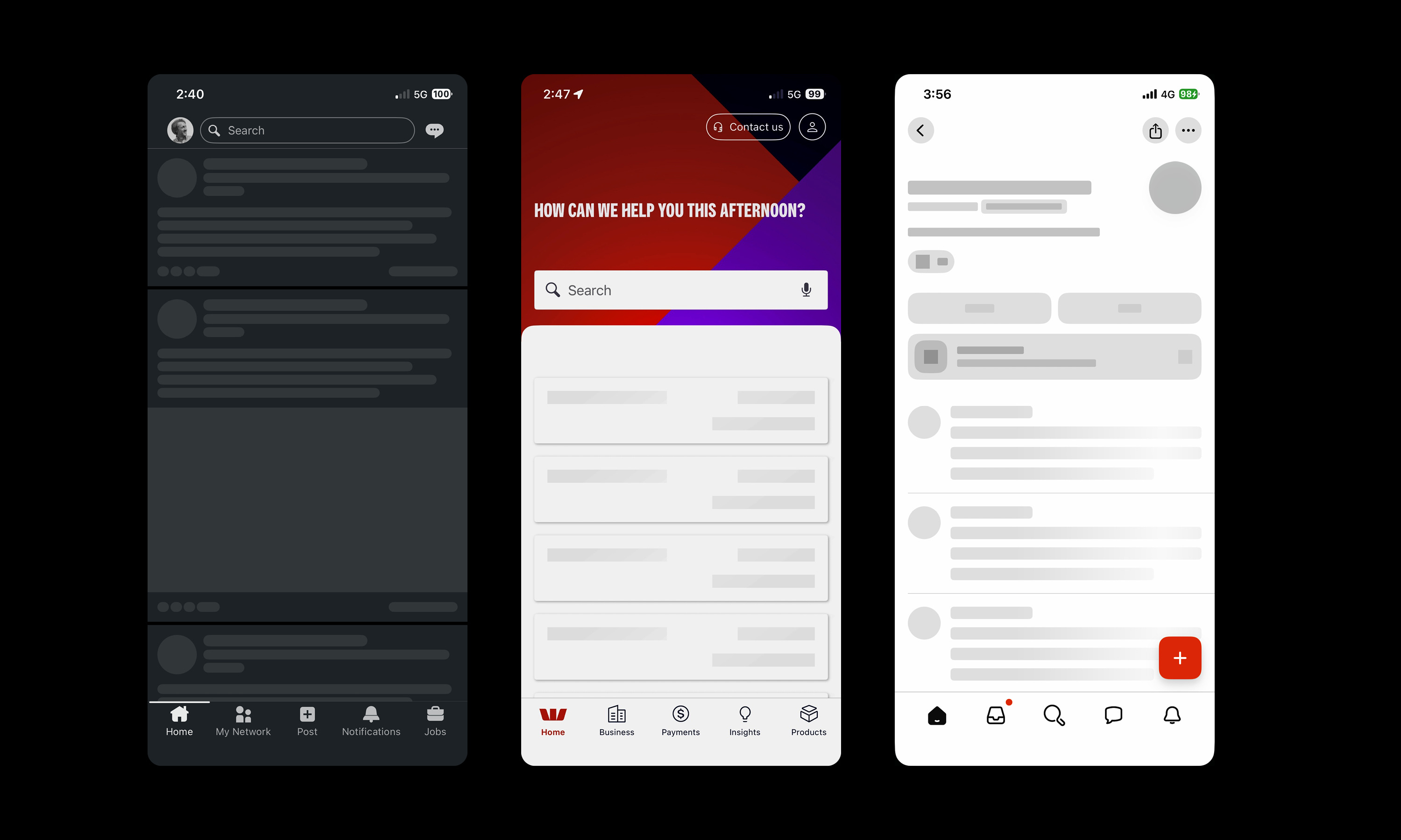
Design software reinforces this abstraction. Adobe InDesign utilises a display feature called ‘greeking’ that replaces small, unreadable text with grey, horizontal, or placeholder bars to speed up document redrawing.
Seen this way, typography is not merely an element styled at the end of a process, but something to be considered from the very beginning. Whether sketched in pencil, reduced to bars, or abstracted entirely, typographic structure reveals how meaning is organised and composed before it is read; mastering that structure remains a defining marker of typographic expertise.