

Advertising type.
Is Australian advertising waking up to the power of type and design?

On Australian screens and streets, typography is having a moment. Though still very much in the minority, a select few creative agencies are using type — and design craft more broadly — as a tool to build distinction, sharpen brand perception and cut through the visual noise.
Leading the charge are independent studios with rock band names like Bear Meets Eagle On Fire (BMEOF) and SICKDOGWOLFMAN, along with the more conventionally titled Howatson+Company; all are producing work that looks more at home in a design studio portfolio than an advertising reel. When underpinned by long-term thinking aimed at amplifying and evolving a brand identity, the results are hard to ignore: awards won, clients acquired, and a sense that something profound, for both advertising and design in this country, may be happening.
BMEOF describes itself as ‘part consultancy, part design and advertising studio’. Together with their collective +61, they are building a body of work for Telstra that maximises on their hybrid agency model, combining smart, strategic thinking underpinned with a solid design thread. By grounding campaigns in MAUD’s rigorous 2024 identity refresh and layering in incisive storytelling, the agency has elevated Telstra’s brand presence while repositioning it as more imaginative and culturally engaged. It’s a rare example of short-term campaign needs sitting comfortably within broader identity thinking rather than working against it.


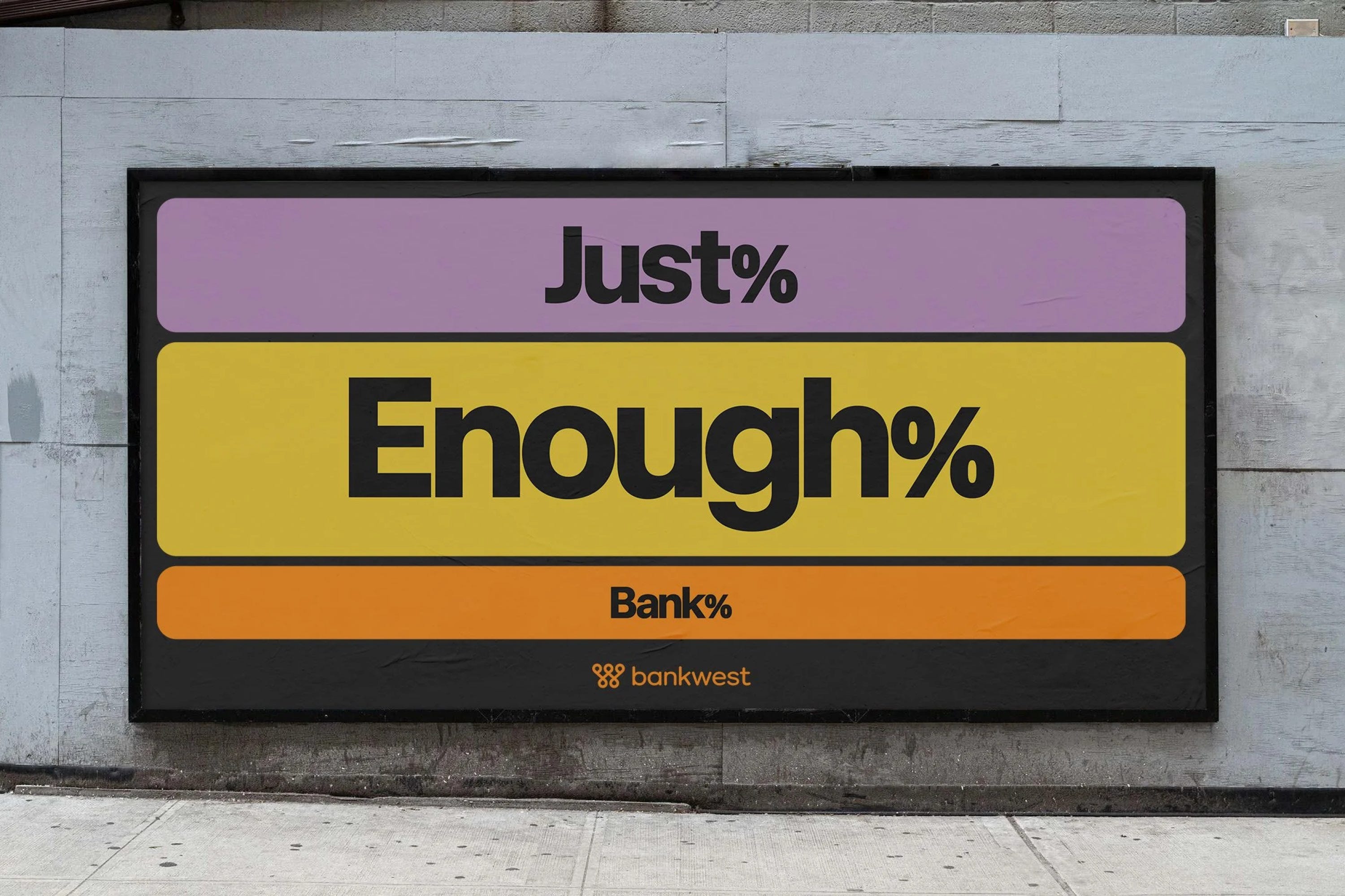
Elsewhere, BMEOF’s ‘Just Enough Bank’ platform for Bankwest demonstrates the same design-led attitude. The campaign celebrates the daily domestic routines apparently liberated by the bank’s simpler customer experience. In OOH applications, these individual moments are expressed as data-like visualisations composed simply of colour, type and inventive copy. The campaign’s clarity and restraint are what make it effective, and distinctive. Some of the typographic execution — particularly the overly compressed letter-spacing — make readability challenging in back-lit contexts, but it is refreshing to see language and type given room to lead such highly visible work.


Though ‘proportionality’ feels like a campaign concept, it is the foundation for a refreshed design system that it seems will be integrated into all aspects of the brand. Sometimes, what works so successfully for the short-term (campaign) can be difficult to translate to the long-term (identity), given the need to stretch across so many applications. As a Bankwest customer, I’ll be following the identity’s evolution intently.


Design is also a key pillar of Howatson+Company’s offer. I first encountered their work as a judge in the 2023 DINZ Best Design Awards. Matilda Bay’s ‘Rejected Ales’ stood out for its utilitarian, deliberately under-designed aesthetic; and the rare alignment of concept and execution — a balance advertising often aspires to without success. The campaign showcased the brewery’s obsessive commitment to quality by turning 27 near-miss attempts into a limited-edition range. Each can told the story of why that batch was rejected, reinforcing the rigour behind the final, perfected Original Ale.


Their responsive identity for Triple J, which was awarded ‘Best in Show’ at the 2025 AGDA (Australian Graphic Design Association) Awards, is another example of the agency’s design+advertising approach. Working with Sydney foundry Family Type, the agency created a system where audio input reshapes typographic forms, creating unique, sound-driven logos for the station and shows. The idea is compelling, if not completely original (Collins and Dinamo’s 2021 identity for the San Francisco Symphony comes to mind), and one wonders about the durability of the identity, given its reliance on an aesthetic aimed squarely at ‘gen-z, gen-alpha or gen-whatever-the-hell-comes-next’. Sensibly, Howatson+Co have not discarded Triple J’s iconic drum symbol, updating and retaining it as an important, recognisable anchor for those older folk struggling with the legibility of the type.


Despite my quibbles, seeing such a high profile identity founded on experimental type originating from an advertising agency is refreshing, and somewhat alarming given this is traditionally design studio territory. With potential to elevate the perceived value of design and type, agencies capable of delivering design in-house are absorbing work that has traditionally gone to studios, intensifying competition for top-tier talent and eroding the value of specialist expertise with their ‘one-stop-shop’ offer.
Of course, typography still functions well in its more traditional role elevating a headline. The Idea Shed’s launch of Mentos Cube gum uses the compact punch of ‘Bite me’, tightly set in GT Walsheim Ultra Bold and locked into a neat square — a simple, well-judged typographic gesture combined with striking imagery aimed squarely at Gen Z.

M&C Saatchi has a long history of creative collaboration through their partner design business Re. In late 2020, CommBank launched an evolution of their brand identity by Re, simplifying and aligning it with the long-running ‘Can’ brand platform introduced by M&C Saatchi in 2012. ‘Doubt Never Did’ reframes this strategy, leaning heavily into headlines set in an extra bold cut of the bank’s custom typeface to bring urgency and volume. As a standalone element in teaser street posters, the type is given room to do its job, but when combined with somewhat cliched imagery and CommBank’s yellow diamond graphic, its strength is diluted.

Assuming the chaotic image below is real, it presents a strong argument for rationalising and dialling down, rather than shouting with every available asset. Is the message of certainty and optimism communicated any more successfully by repeating it countless times within the confines of a busy airport walk-through? From a brand identity perspective, the shift to extra bold both typographically and tonally perhaps signals a desire to be louder than CommBank’s competitors; it certainly provides a counterpoint to Bankwest’s approach. The substitution of ‘CommBank’ for ‘Can’ in the logo in campaigns is also intriguing, an approach that started over ten years ago. There’s probably an argument about brand recognition being so high that the bank’s name becomes secondary (or invisible); within the context of an airport where tourists or those unfamiliar with the identity see it for the first time, it must be rather confusing. Perhaps a logical assumption is that there’s a long-term strategy to change the bank’s name to ‘Can’.

As evidenced by the strongest of these examples, smart Australian advertising agencies and hybrid studios understand that typographic clarity, disciplined identity systems and rigorous execution aren’t aesthetic luxuries — they can drive distinction, coherence and strategic clarity. When advertising aligns itself with long-term brand thinking — rather than working against it — the results speak for themselves. Increasingly, design craft isn’t simply elevating the work; if it hasn’t always been, it’s fast becoming a prerequisite for effective, modern advertising.